I raved about the Goodnotes app in several posts, saying that it has largely replaced pens and notebooks for me. I still stand by its strengths: digital notebooks can be synced on all devices; its ability to search through handwriting recognition; its flexibility when it comes to sharing and exporting notes, etc. What I’m a bit tired of is how unpleasant it is to write on the screen of the iPad, even when I have a Paperlike screen protector. I never got used to it, and my handwriting looks worse than it does on paper.
I wrote about ‘grail pens’ 10 months ago. There’s something satisfying about the nib of a fountain pen gliding on the paper surface, laying down a tangible trail of expressive, undulating marks. I like how fountain pens write effortlessly without having to press hard. Writing on a screen can never replace the sensual quality of putting pen to paper, especially when it comes to fountain pens. For me, writing in long hand is not conducive to fluency of formulating thoughts in prose, as I write slowly and my hand cannot catch up with my brain. I described this as ‘congruency or fluency between thought (ideation) and action (preservation, or production)’ two years ago. But pen and paper are good for planning and ideation, and for the occasional letters and notes.
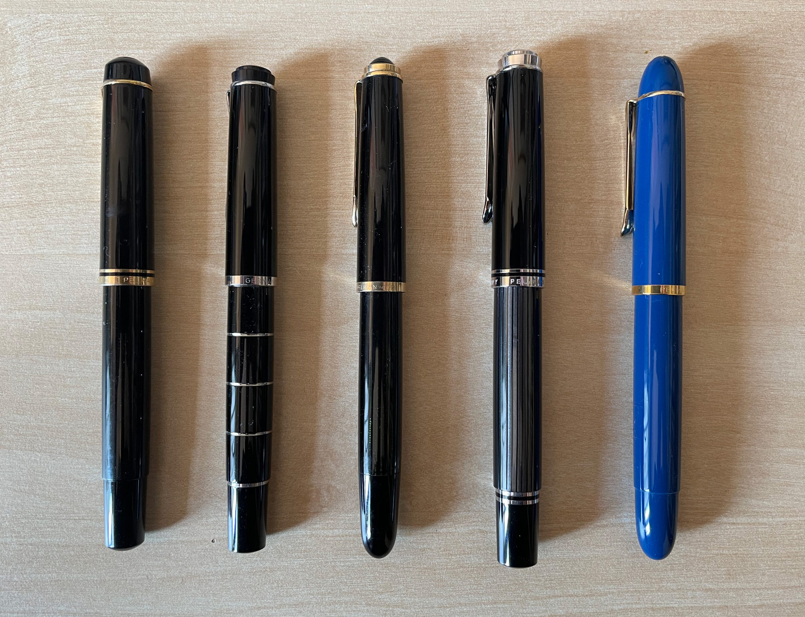
I have since rekindled my love for ink on paper, and have accumulated a small (?) stash of fountain pens and inks. Four of these pens are Pelikans, same brand as my first ‘proper’ fountain pen back in 1992. It’s now my favourite brand.
The remainder of this post are musings about these five Pelikan fountain pens, written with the respective pens in longhand using different inks.
![A writing sample written with a fountain pen. The text reads:
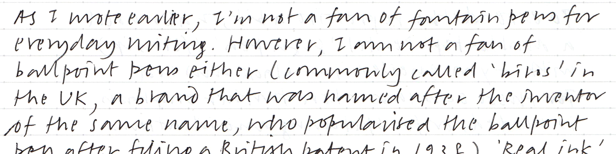
Pelikan 400NN c1950s 'EF' nib
Montblanc Midnight Blue ink
A 'vintage' Pelikan possibly from the 1950s. A flexible 14C gold nib that's very pleasant to write with. A all pen with subtle green and black translusent [sic] striations on the barrel. A beautiful writer.](https://nontxt.com/wp-content/uploads/2022/03/pelikan-400nn-sample.jpg)
![A writing sample written with a fountain pen. The text reads:
Pelikan Souverän M605 Stresemann
'F' nib Diamine Oxford Blue ink
This is my most expensive Pelikan to date. A classic yet understated pen design, more subtle than the regular green or blue stripes with gold trim. The grey strips are an homage to Gustav Streseman [sic], a Nobel Leave Prize recipient in 1926. Streseman [sic] is attributed for a kind of suit with thin grey stripes, hence the name of this pen. Souverän is Pelikan's flagship series. The numbers refer to the size of the pens and nibs, from 100–1,000, 1,000 being the largest. I find the size of this 605 perfect for my hand. The nib is Rhodium-plated 14C gold, which writes extremely smoothly. Very enjoyable to write with. Though the 'F' nib is a tad too think for my handwriting. This is now my favourite pen in my entire collection.](https://nontxt.com/wp-content/uploads/2022/03/pelikan-m605-sample.jpg)
![A writing sample written with a fountain pen. The text reads:
A retro relaunch of Pelikan's classic 10 school pen from 1955. This is a 018 special edition that comes with a retro style presentation box with a bottle of ink (the ink I'm using now). The pen's styling is quite minimal in a beautiful blue and gold trim. The gold-plated stainless steel [nib] is surprisingly thin for an 'F' nib, and it's very flexible. A very leasing pen.](https://nontxt.com/wp-content/uploads/2022/03/pelikan-m120-sample.jpg)
(First and final draft of this post written in Byword on the iPhone 12 Mini and iPad Pro. First and final draft of the writing samples written in ink on Tomoe River paper, 52g/m² then scanned.)