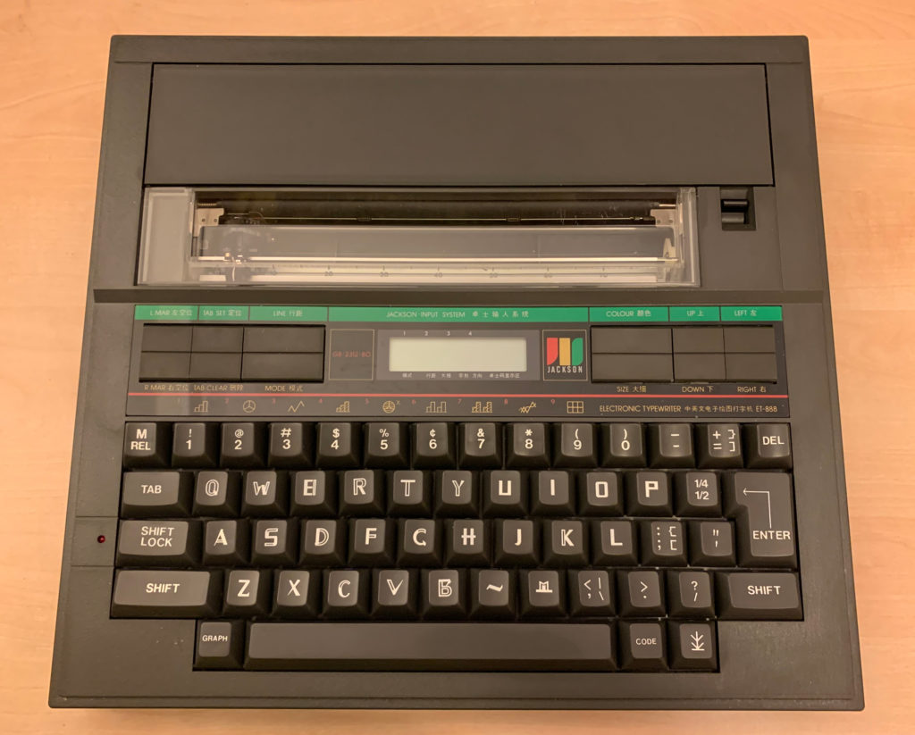
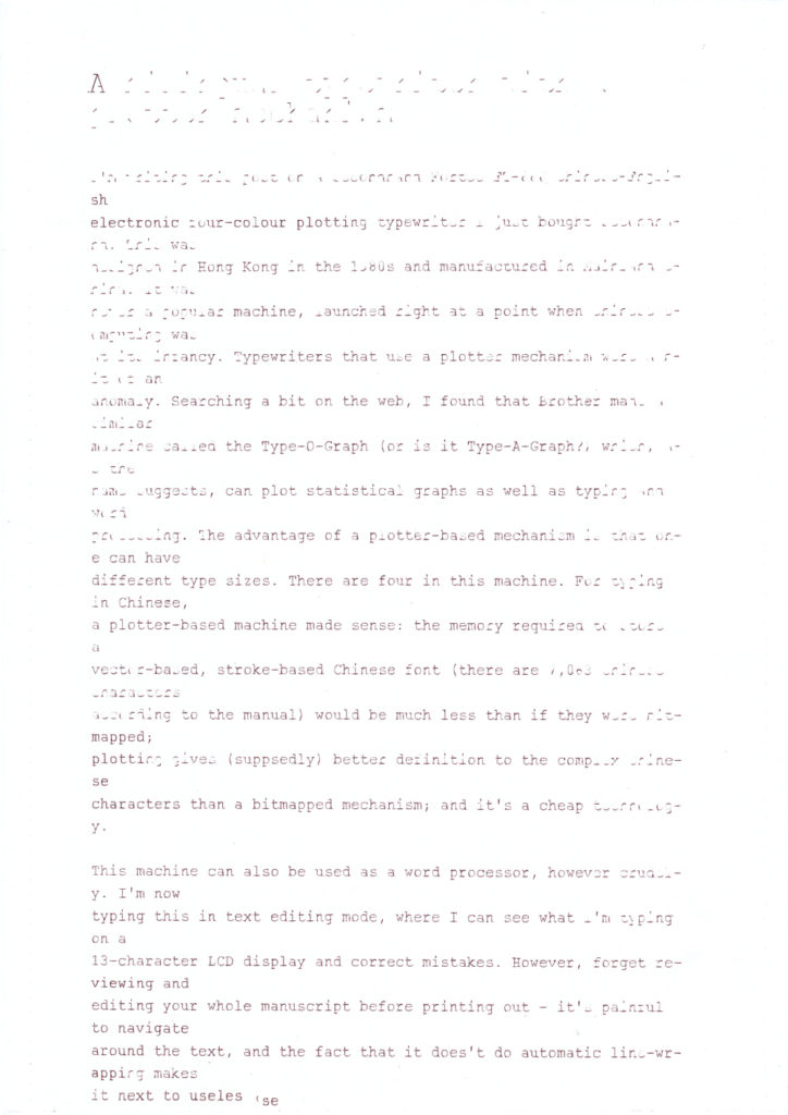
I’m writing this post on a secondhand 科達牌中英文電子四色繪圖打字機 Fortec ET-888 Chinese–English electronic four-colour plotting typewriter I just bought. This was designed in Hong Kong in the 1980s and manufactured in Mainland China. It was never a popular machine, launched right at a point when Chinese computing was at its infancy. Typewriters that use a plotter mechanism were a bit of an anomaly. Searching on the web, I came across a plotter typewriter made by Brother and Sears called the Type-O-Graph (or is it Type-A-Graph?), which, as the name suggests, can plot statistical graphs as well as typing and word processing. Incidentally, I never realised that cheap plotters were available for home use in the 1970s–80s. This typewriter uses the same kind of mechanism and pens as the Atari 1020 and Commodore 1520 plotters. There are still a lot of enthusiasts of these plotters out there but new pens are a bit hard to come by.
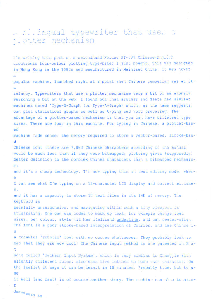
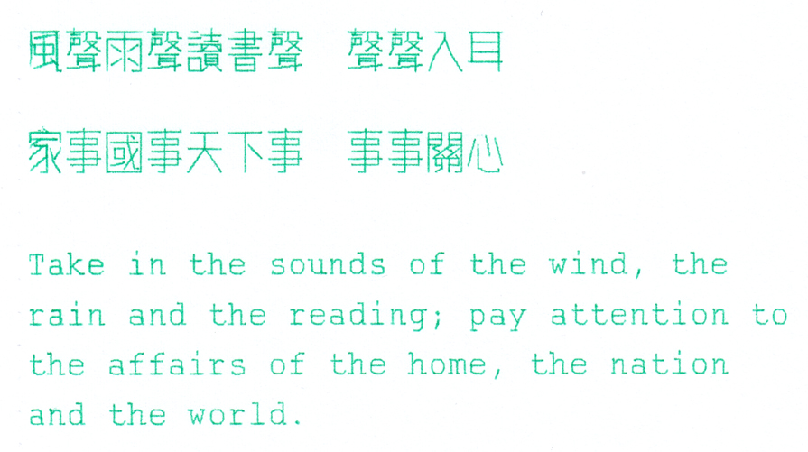
The advantage of a plotter-based mechanism is that it can have different type sizes, and can make drawings. For typing in Chinese, a plotter-based machine made sense: the memory required to store a vector-based, stroke-based Chinese font would be much less than if they were bitmapped (this machine can print 7,063 Chinese characters). Plotting also (supposedly) gives better definition to the complex Chinese characters than a bitmapped mechanism. And it’s a cheap technology. The image is quite faint though, and it is not able to produce bold type.
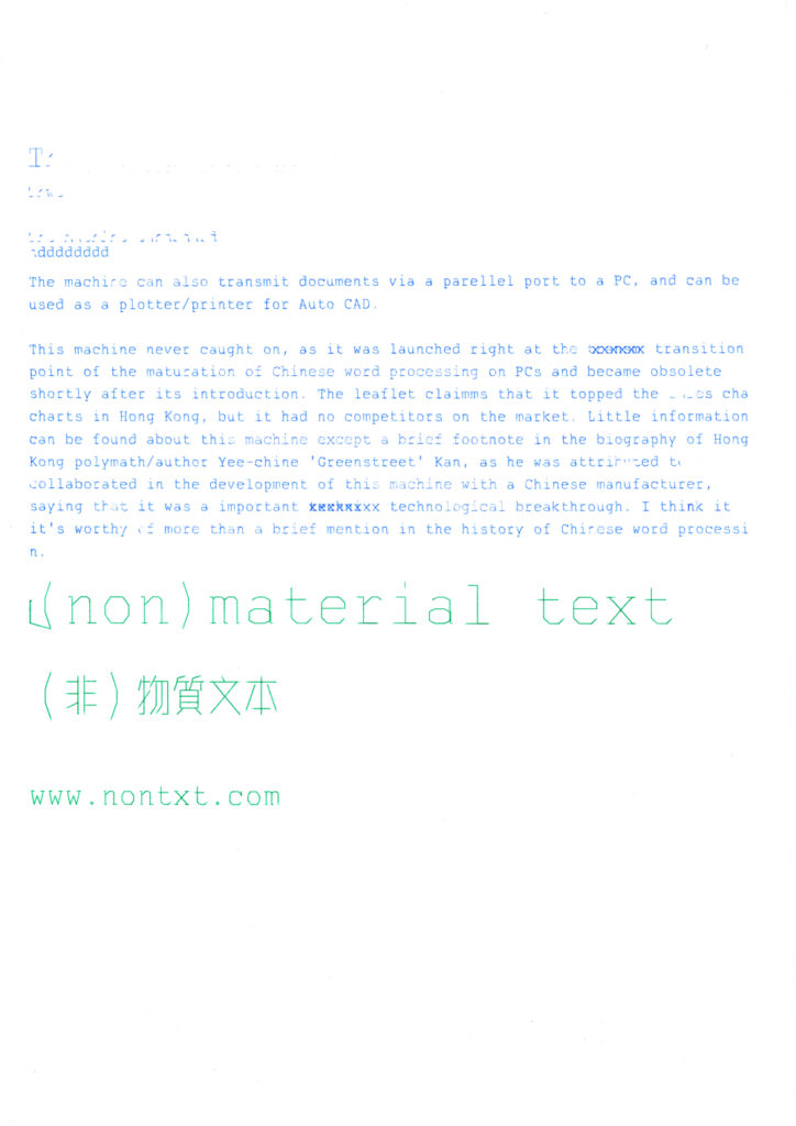
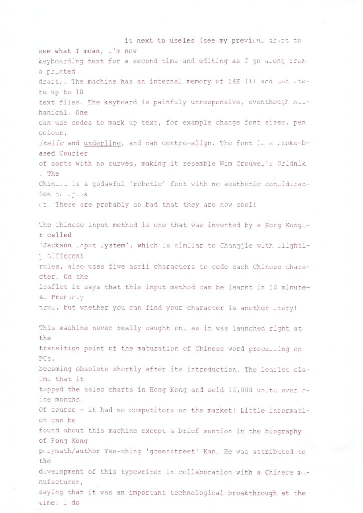
This machine can be used as a typewriter, printer/plotter (hooked up to a PC through its parallel port) and a word processor, however crudely. The first and second drafts of this post were written on this machine in word processing mode. With a 13-character LCD display, text can be corrected and edited before printing out. The machine has an internal memory of 14K (!) and can store up to 10 text files, and transmitted to a computer if needed (why would one do that I wonder). Text can be marked up using control codes to change attributes such as font sizes, pen colour, italic/underline and centre alignment. The keyboard is terribly unresponsive. Forget about reviewing and editing whole manuscripts before printing out – it’s painful to navigate around in the tiny viewport, and the fact that it doesn’t do automatic line-wrapping makes it next to useless (see the numerous unsucessful printouts that I made in the images below). I’m now re-typing and editing as I work from my two printed drafts.
First draft of this blog post (page 1)
First draft of this blog post (page 2)
Second draft of this blog post (page 1)
Second draft of this blog post (page 2)
Second draft of this blog post (page 3)
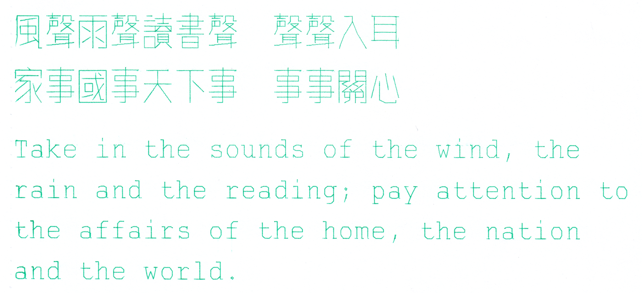
The font is a stroke-based Courier of sorts with no curves, making it resemble Wim Crouwel’s Gridnik. The Chinese is a godawful ‘robotic’ font with no aesthetic considerations to speak of. These are probably so bad that they are the new cool.
Chinese type sample in medium size and English sample in small sizeChinese type sample in large size and English sample in medium size
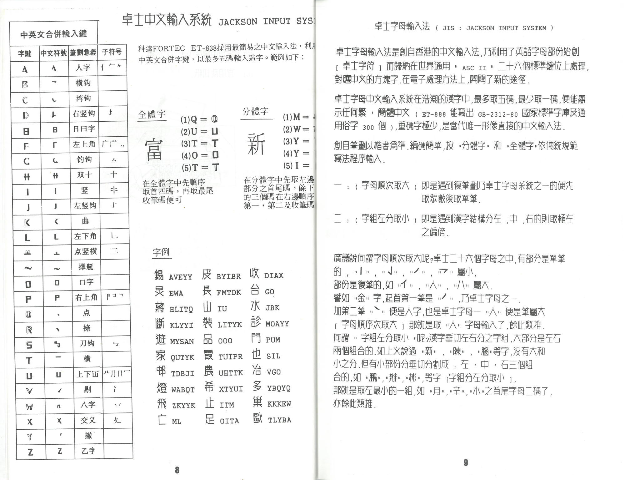
The Chinese input method is one that was invented by a Hong Konger 區卓宣 Cheuk-suen Au (transliterated) called 卓士字母輸入法 Jackson Input System, which is similar to Changjie with slightly different rules, and also uses five ascii characters to code each Chinese character. On the leaflet it says that this input method can be learnt in 10 minutes. Probably true, but whether you can find your character is another story.
A double-page spread from the user manual, explaining how the Jackson Input system works
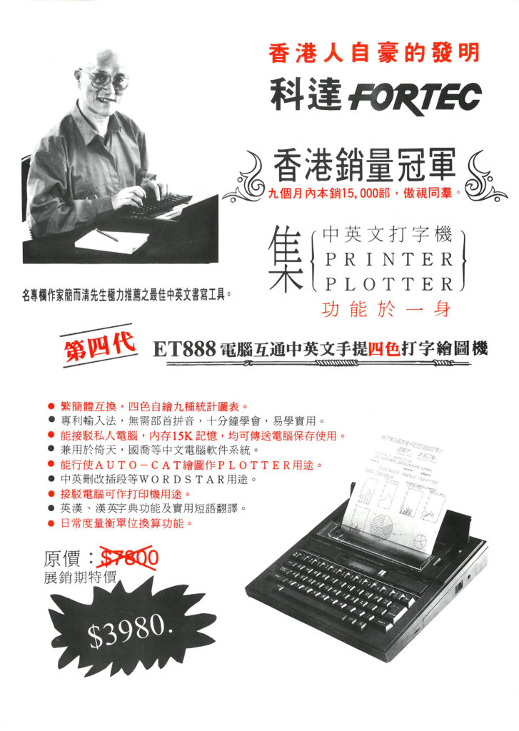
This machine never really caught on, as it was launched right at the transition point of the maturation of Chinese word processing on PCs, becoming obsolete shortly after its introduction. The leaflet claims that it topped the sales charts in Hong Kong and sold 15,000 units over nine months. Of course: it had no competitors on the market. Little information can be found about this machine except a passing mention in the Wikipedia page of Hong Kong polymath/author 簡而清 Yee-ching ‘Greenstreet’ Kan. He was attributed to the development of this typewriter in collaboration with a Chinese manufacturer, saying that it was an important technological breakthrough at the time. I do think it deserves more than a footnote in the history of Chinese word processing.
A promotion leaflet for the typewriter. The red text in the top right reads: ‘an invention that Hong Kongers are proud of’.
(I’m sharing these here as historical records of a legacy technology. If you believe this violates copyright, please let me know and I’ll take them down. )
(First and second drafts written on the Fortec ET-888, final draft in Byword)
I find that I don’t write the best when I use a fountain pen. Why is that? Is it because the nib is a bit large and I can’t see what I’m writing properly? Is it the ink flow? Is it how the nib interacts with (scratches) the paper surface? Is it because the ink takes too long to dry? It may well be all of the above, but I tend to think that it might be psychological: that writing with a fountain pen feels a bit ‘ceremonial’ or ‘ritualistic’, hearkening back to a time when writing was more formal and when communication was more precious and less ubiquitus. I find that the more expensive the pen and the nicer the quality of the paper, the more difficult it is to write nicely. I began using fountain pens when I was in primary school, so why would it be an issue? Perhaps it has something to do with my taking up of calligraphy as a serious hobby, where a lot of discipline is involved?
Learning calligraphy was a process of copying exemplars of different ‘scripts’ or ‘hands’, which is a very self-conscious process. At first the objective is to imitate, stroke by stoke, letter by letter. The first mission is to make sure that the letterforms look exactly like those in the examplar. Not until after the forms are retained in memory does one start to see individual letterforms as groups, forming words, sentences and passages. It is then that the idea of rhythm or flow comes to the fore. The forms of the letters have to become second nature before rhythm can be achieved. A degree of spontaneity is necessary. If one is too self-conscious about each letter they are forming, the rhythm won’t come naturally. Self-consciousness makes writing appear contrived and unnatural. Getting warmed up first usually does the trick. Or just not be too precious about any piece of writing and let it come naturally. Easier said than done. I often run into this problem.
Does handwriting convey personality? Graphologists seem to think so. But we have been taught to write in a certain prescribed way. Or for calligraphers, we learn to write different scripts/hands and can imitate numerous styles, so perhaps we calligraphers are a bit different? Not sure about personality, which runs deep. But moods and feelings at the moment of writing can perhaps be easily conveyed. Do digital text and typsetting work as disguise then, and strip texts of any authenticity? How can authenticity be conveyed in published texts?
(first draft written in ink on paper, final draft in Byword)
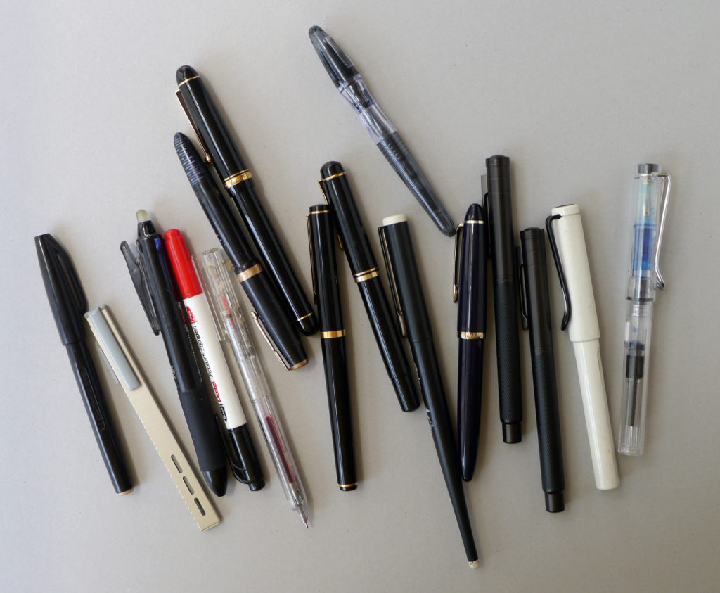
Yesterday morning I started a pen journal and wrote 14 entries using 14 different pens that I have. Rarely do I write continuous prose out entirely in longhand, yet ideas and words flowed just as easily as typing on a keyboard. Edited final draft below, illustrated by first drafts and the respective pens discussed. These are in no particular order; all but the last three are fountain pens.
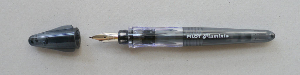
1 Pilot Pluminix
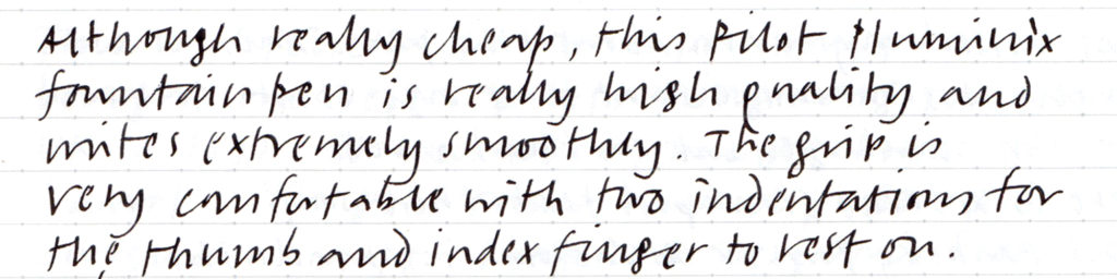
Although really cheap, this Pilot Pluminix fountain pen is high quality and writes smoothly. The grip is comfortable with two indentations for the thumb and index finger to rest on. The pen has a short barrel, 12 cm with the cap on. The cap is screw-on and does not have a clip, but has two protrusions that keep it from rolling off the desk. The ‘F’ nib is in fact a narrow (around 0.5mm) italic (stub) nib, ideal for everyday handwriting. The thin strokes are quite fine, which is rare for an italic fountain pen. One of my favourite pens here. Here’s a review of this pen
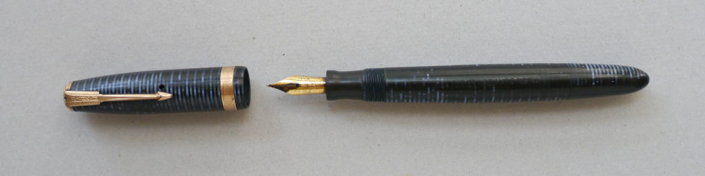
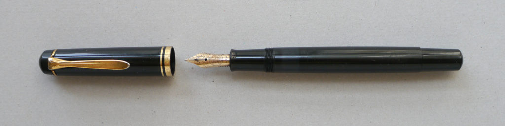
2 Parker Vacumatic
This pen is amongst a bunch of old pens that my parents passed onto me. I had never tried writing with it until today. Apparently dad bought it some time ago, secondhand. On the barrel the words ‘Geo S Parker / Parker Vacumatic, made in USA / 63’ are blind stamped onto it. Some Googling revealed that it is a ‘Blue Diamond’ made between 1942–48. Quite a beautiful pen. After writing for a bit the ink seems to flow quite well. The nib is gold-plated, with the words ‘Artus radium point 93’ written on it. It is a little worn from use, I guess adapted to the writing angle of its previous owner.
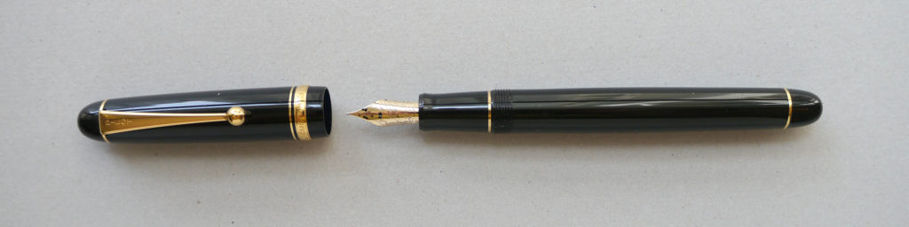
3 Pelikan c1992
My parents bought me this Pelikan fountain pen before I left Hong Kong for the UK in 1992. It has a simple glossy black barrel with gold trims and clip. It was bought at a pen shop on the ground floor of the old Man Yee Building on Pottinger Street, which of course is long gone. Going overseas to study was a big deal in those days, and this expensive pen was a parting gift. The piston action for ink filling in this pen is fantastic: unscrew, dip in ink, screw tight, and it fills right up. The nib is gold-plated, a Pelikan 120–500, HEF. I used this pen for my school work throughout secondary school and the nib is very worn, giving thick and thin lines. The line weight has become too heavy for my taste. It has always been slightly scratchy to write with.
I used to use the Parker ‘Quink’ blue–black ink with this pen. At one point I switched to washable blue so that mistakes could be corrected using a bleach ink-eraser and overwritten with a felt-tip of a similar colour. I never did like the purplish blue though. This ink is Lamy’s black bottled ink, which is a beautifully dense black.
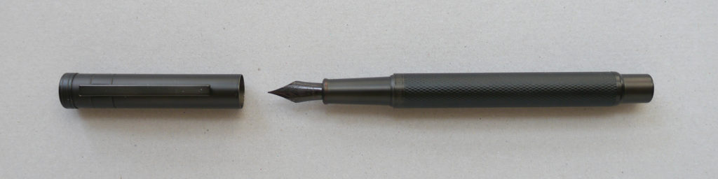
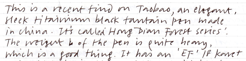
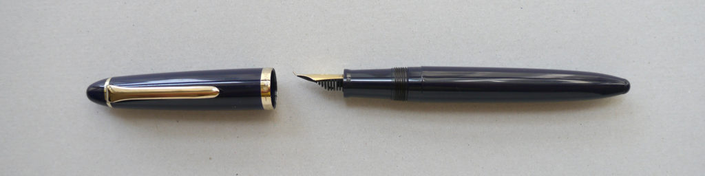
4 Hong Dian forest series
This is a recent find on Taobao, a sleek black titanium fountain pen with contemporary styling made in China. How they can charge only ¥46 RMB is beyond comprehension. The pen feels heavy on the hand, possibly a good thing. The build is very solid, with a criss-cross texture on the barrel. This one is fitted with an ‘EF’ nib quich is quite fine and works well with my regular writing size. It writes very smoothly, probably the smoothest amongst all of the fountain pens I own. When you put the cap on there is a very satisfying click, an added bonus. The piston action convertor works well, and I’ve filled it up with the black Lamy ink.
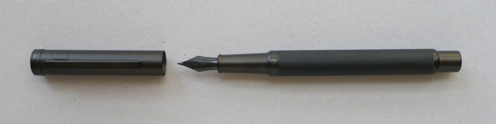
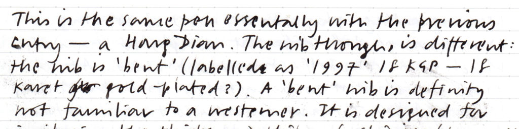
5 Hong Dian forest series with a Chinese calligraphy nib
This is identical to 4 but fitted with a Chinese calligraphy nib. Not to be confused with a brush, a Chinese calligraphy nib is like a regular pointed nib but bent at an angle. This type of nib probably look a bit strange to Western eyes. It is designed for imitating the thicks and thins of Chinese/Japanese calligraphy by varying the angle at which you hold your pen (in brush calligraphy one varies the pressure to vary stroke widths). Of course you can use it to write in Latin or other scripts.
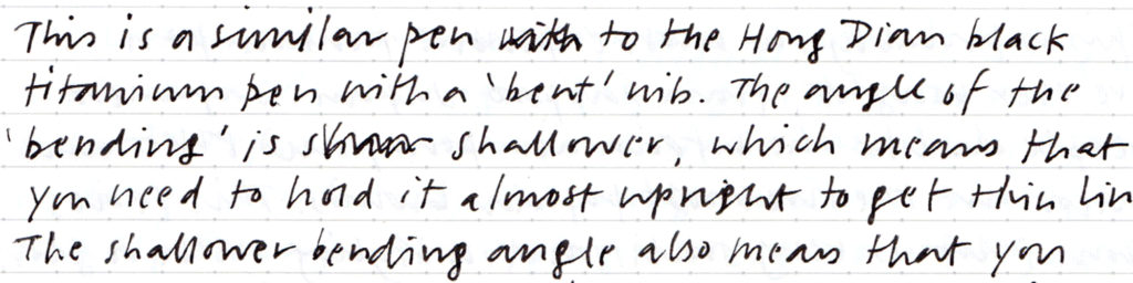
6 Sailor Profit calligraphy fountain pen
This is the same type of pen as 5, but Japanese-made. I first came across this type of pen at Tokyu Hands in Japan, where I bought it from. The ¥2100 JPY price tag isn’t exactly cheap, but in terms of quality it is comparable to 5. The angle of the bending is shallower, which means that one needs to hold it almost upright to get thin lines. It also means that a much thicker stroke can be produced.
7 Pilot Custom 74
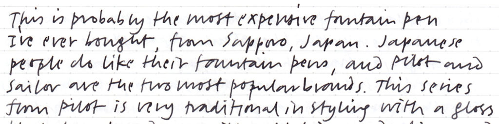
This is probably the most expensive fountain pen I’ve ever bought. I bought it from a large stationery store in Sapporo, Japan (remember to seek out stationery stores when you go to Japan!). Japanese people do like their fountain pens, and Pilot and Sailor are the two most popular brands. Incidentally in Japan they call fountain pens 万年筆, literally ‘ten thousand year pens’. This series from Pilot is traditional in styling with a glossy black barrel and gold trims and clip. The nib is gold-plated. This series offers a wide variety of nib types with a range of thicknesses and degrees of flexibility. This particular nib is very flexible, so flexible that you can write copperplate script with it. The stroke width will transition from thin to thick by applying pressure on downstrokes. This is a very high quality product that writes very smoothly.
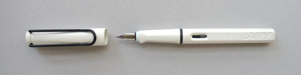
8 Lamy Safari
The Lamy Safari fountain pen is a classic design by Wolfgang Fabian. The bold, modern design won an IF design award in 2007. The nib is stainless steel, and I replaced the original fine nib of the two I have with 1.1 mm italic nibs. I own an orange one and white one (hard to keep clean). The series comes in all sorts of vibrant colours, and they keep introducing new ones. The design of the Safari is easily one of my all-time favourites, though of reasons unbeknownst to me, the two that I own never did become my everyday pens. This ink is Lamy’s Turquoise T52 bottled ink, which I use with the excellent piston action convertor. This colour is simply gorgeous, and is very dense. The industrial design of the bottle is also beautiful, with a ‘valley’ at the bottom so that one can get to the last remaining drop. A roll of perforated blotting paper is rolled into the base for wiping excess ink off the nib after filling – very considerate.
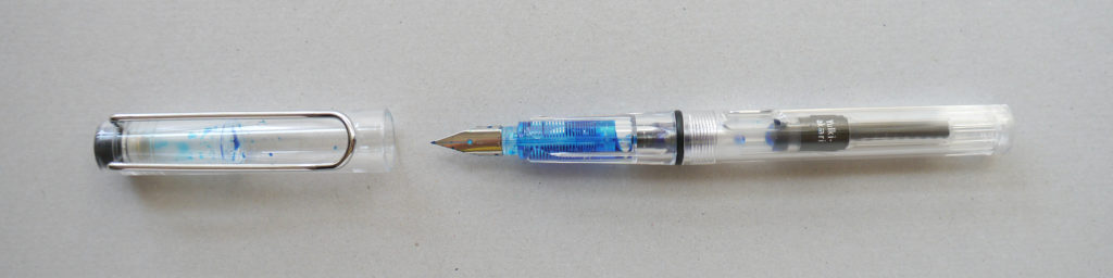
9 Memory, a Safari knock-off
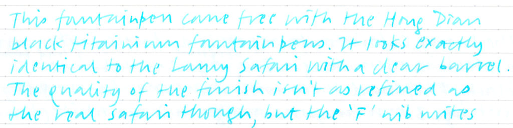
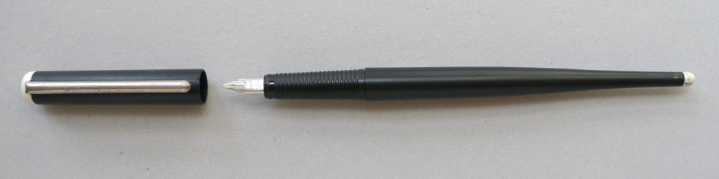
No idea why this pen made the list, but here you go. This fountain pen came free with the Hong Dian black titanium pens. It looks exactly identical to the Lamy Safari with a clear barrel. The quality of the finish is nowhere near as refined however. The only redeeming factor is the smoothness of the ‘F’ nib – it writes really well. The ink is Sailor’s ‘Shikiori’, in Yuki-akai 雪明. The ink is way too thin and watercolour-like, not great for writing.
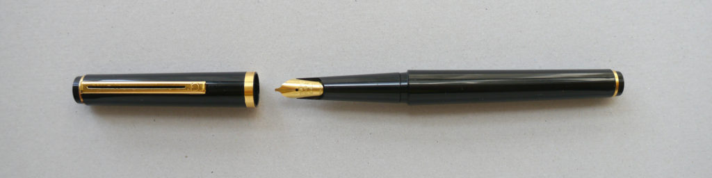
10 Rotring Art Pen
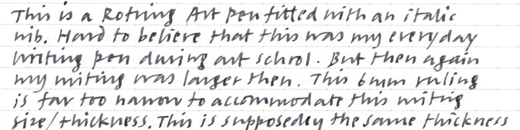
This is Rotring Art Pen is fitted with an italic nib. The styling looks dated by now, very 1980s. Hard to believe that this was my everyday pen during my art school years. My writing was much larger then. The 6mm line rules feel far too narrow for a pen this thick. This is supposedly the same thickness as the Lamy Safari (1.1mm), but apparently not. The nib is so worn from heavy daily use that the thin strokes have become quite thick. Rotring used to make a nib-sharpening stone, but I never bought one. The long staff/barrel serves no practical purpose, other than imitating a traditional calligraphy dip-pen. This supposedly black cartridge is too feeble. The original Art Pen ‘Jet Black’ cartridges were extremely dense.
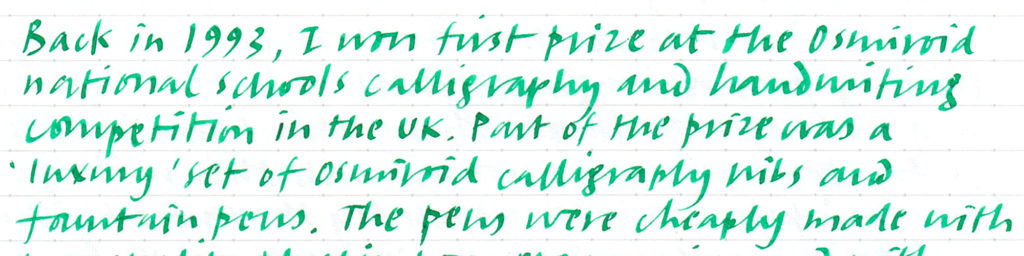
11 Osmiroid
Back in 1993, I won first prize at the Osmiroid national schools calligraphy and handwriting competition in the UK. Part of the prize was a ‘luxury’ set of Osmiroid calligraphy fountain pens with a wide variety of nibs. The pens were cheaply made with poor quality plastic and finishing, poor ergonomics and with really poor ink flow. Never did use them much at all, though I still have them. This particular one is of slightly better quality that I bought from a close-out sale of a stationery store here in Hong Kong around seven years ago. It’s very uncomfortable to hold, hence I’m wiring at a weird pen angle. The Osmiroid pen company apparently dates back to the early nineteenth century, founded by educationist James Perry. It was bought by Berol Limited in 1989, and it doesn’t look like the brand exists anymore.
Cheap, everyday pens
12 Muji multifunction gel pen with mechanical pencil
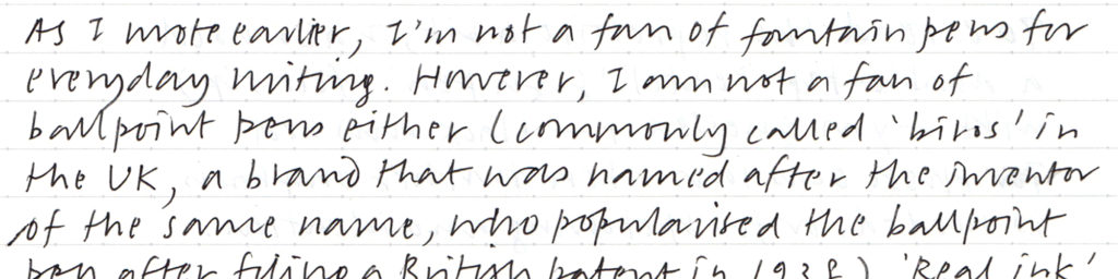
I’m not a fan of fountain pens for everyday writing, and I’m not fond of ballpoint pens either. Real ink from a gel or roller ball pen is what I prefer. Clean lines and quick drying ink are important. I’ve experimented with many (mainly Japanese) brands, and find that Muji’s clear barrel muiltifunction gel pen with mechanical pencil to be the best. As of today, I don’t see this pen in their online catalogue anymore. Good that I still have a large stash of refills in my drawer.
I think it was Roger Black who said that if the first colour was black, then the second colour would be red. This is true with early manuscripts, letterpress printing (the word ‘rubrication’ means the addition of red, for both manuscripts and early incunabular) as well as in manual typewriters. Red is very useful for differentiating content and to provide an additional layer of information. That’s why in my multifunction pen I have red and black inks, and with a mechanical penil as well, my arsenal of writing implements is complete. I find 0.4mm to be ideal, for my current size of handwriting on 6mm ruled paper. The pencil is 0.5mm with HB lead, for tentative thoughts and mark-making, say, constructing a grid for a page layout.
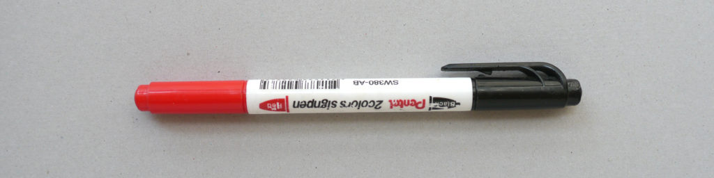
13 Pentel Sign Pen
To extend the repretoire a bit, I also used to carry a double-tip Pentel Sign Pen around with black and red ink. This is a thick felt-tip for those ocassions where further emphasis is needed, and for sketching and ideation. This is a variant of the classic Pentel single-colour Sign Pen debuted in 1963.
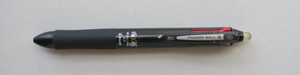
14 Pilot Frixion four-colour
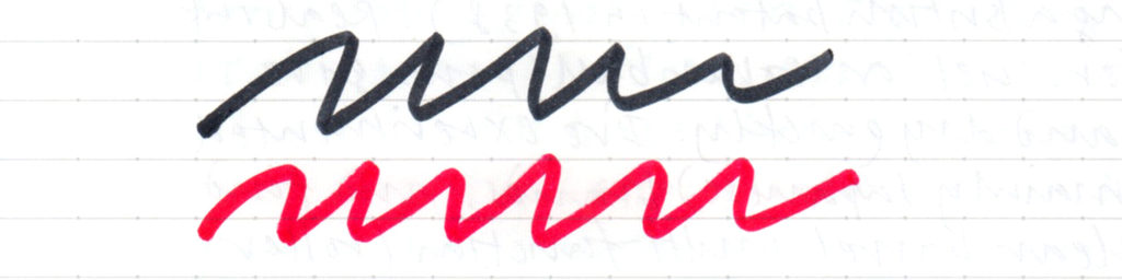
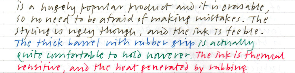
For awhile I also used another multifunction pen – the Pilot Frixion with four colours. It is a hugely popular product. The ink is thermal sensitive, and the heat generated by rubbing with the silicone eraser provided removes the ink marks without residues. This series comes in many variations, but styling of the four-colour multifunction one is ugly, and the ink feeble. Though to be fair the thick barrel with rubber grip is actually quite comfortable to hold. The Frixion series won a Good Design Award in 2015. Overall it’s a very good series of products.
The pen I use the most these days is the Apple Pencil. Incidentally the nib broke off while I was putting this post together. I had to buy a pack of replacements nibs, $140 HKD for four. With a price tag of $999 HKD plus the replacement nibs, it really is the most expensive pen I have in my possession.
With a smartphone always by our side these days, it might not be necessary to carry pen and paper in our pockets anymore. The iPad with Apple Pencil has certainly revived handwriting and has taken it to a different level. Yet its experience is still nowhere as palpable and direct as pen and paper, technologies that don’t require power nor an operating system that will always be there.
More musings on writing in the next post.
(first draft written by hand, final draft in Byword)
While searching YouTube to find videos of typewriter demos (there are lots) I came across this guy named Joe Van Cleave from Albuquerque, USA who has a whole series of videos of him test-driving numerous manual and electronic typewriters in his collection (216 episodes!). I stumbled upon another series of his called ‘confessions of an office supply junkie’ where he reviews different types of stationery. Now it’s my turn to confess: this is also one of my obsessions, and it goes as far back as my early primary school years. I’ve always had a soft spot for nice stationery, but I tend to favour stuff that’s practical rather than novel. Pen and paper (in the form of pads and notebooks) are the bread and butter, and are amongst my favourite objects. I’m lucky that I live above a large shopping centre where there is no shortage of good stationery merely steps away from home, mainly from Japan. To this day, my favourite stuff comes from Japan. But in the past year or so I’ve noticed that the stationery departments of the two Japanese department stores nearby have shrunk in size. I might be one of the culprits of this demise, as roughly a year ago I replaced my paper notebooks with an iPad Pro and the Goodnotes app that I’ve been raving about. Guess visions of a ‘paperless office’ has finally caught on, after its prophecy in Business Week more than 40 years ago. Of course the first vision of it dates further back by Vannevar Bush in 1945 in an article in The Atlantic Monthly titled ‘As we may think’.
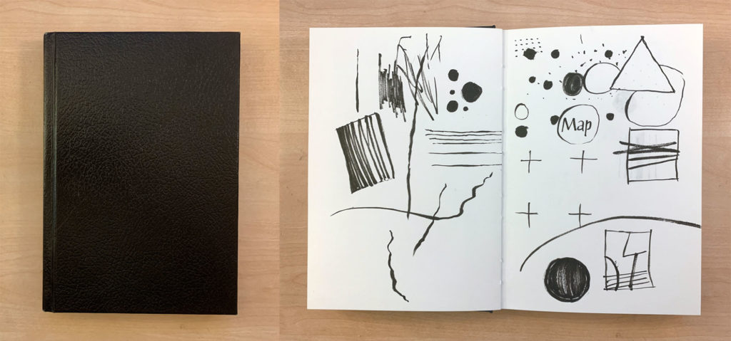
As for many art school-educated people like myself, we have been taught to keep a ‘sketchbook’. We were told to keep it close by at all times, even by your bedside, as you never know when ideas may strike. (Before art school I only had a Filofax, remember those?) Not being much of an artist-type, I struggled to fill the pages of my thick sketchbook. The standard kind that you could buy in Canada had a black hardcover with a heavy cartridge stock inside, casebound. The form of this kind of sketchbook carries the weight and pressure of having to draw a lot and all the time, which just isn’t me at all. I much prefer writing and sorting out ideas by means of words, with occasional drawings as annotations to figure ideas out and to structure concepts. I do sketch layouts, even to this day, and of course to explore letterforms as a type designer.
A black hardcover sketchbook I had when studying in art school
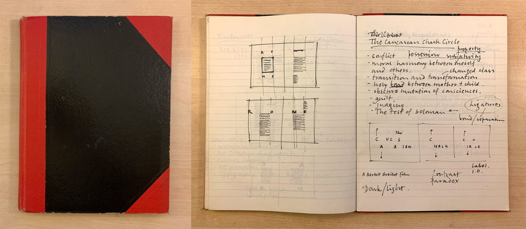
By the second year of art school I moved away from these black casebound sketchbooks to something I was more familiar with: black hardcover with bright red spine and reinforced corners, casebound with a light weight paper inside, faintly ruled in light grey. I bought these from Vancouver’s Chinatown, which I used in secondary school back in Hong Kong. This cheaper alternative immediately provided a freedom that the more expensive ‘artist’s sketchbooks’ didn’t have, and the ideas and thinking process suddenly felt less precious. I began to fill up the pages quickly and went through a few of them.
A classic Chinese black and red notebook I used during art school
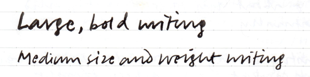
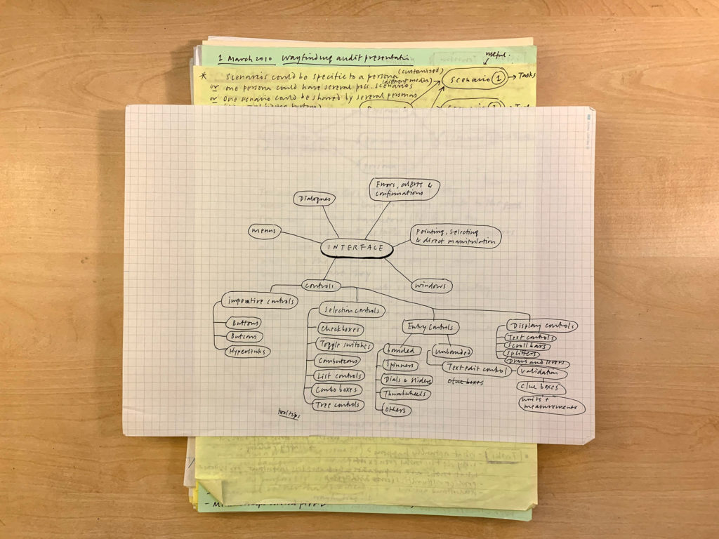
After that I tried different kinds of notebooks and wasn’t loyal to any particular kind/brand. I mainly used ruled paper, and experimented with different increments. How I felt about them depended on the typical size of my handwriting at the time and the kinds of pens that I used. My handwriting has shrunk over the years and now consider 6mm to be optimal. Off and on I tried using ruled index cards and carried a stack of them around held together with a bulldog clip (a so-called ‘hipster PDA’). Or just carrying one A4-size piece of random paper folded twice in my pocket (with a tiny pen) to think things through at a café. Off and on I had also used yellow legal pads and quad pads. My absolute favourite pad is ‘Project Paper’ by Okina Company Limited which won the ‘Good Design Long Life Award’ in 2010. It has been in production since 1985. This ultra smooth paper is very crisp and is extremely high quality, with a very faint non-repro blue 5mm grid. An absolute joy to write with. Not exactly cheap but worth every penny.
A stack of handwritten notes I’ve collected over the years. The top sheet is from a pad of Okina Project Paper
For a short while I was into the Moleskine ‘Cahier’ ruled journal. Softcover with a smooth yellowish paper, saddle stitched, 128×210mm. Portable and with a nice proportion. The 6mm line rules are not quite faint enough unfortunately.
A Moleskine Cahier ruled journal I used at work in Hong Kong
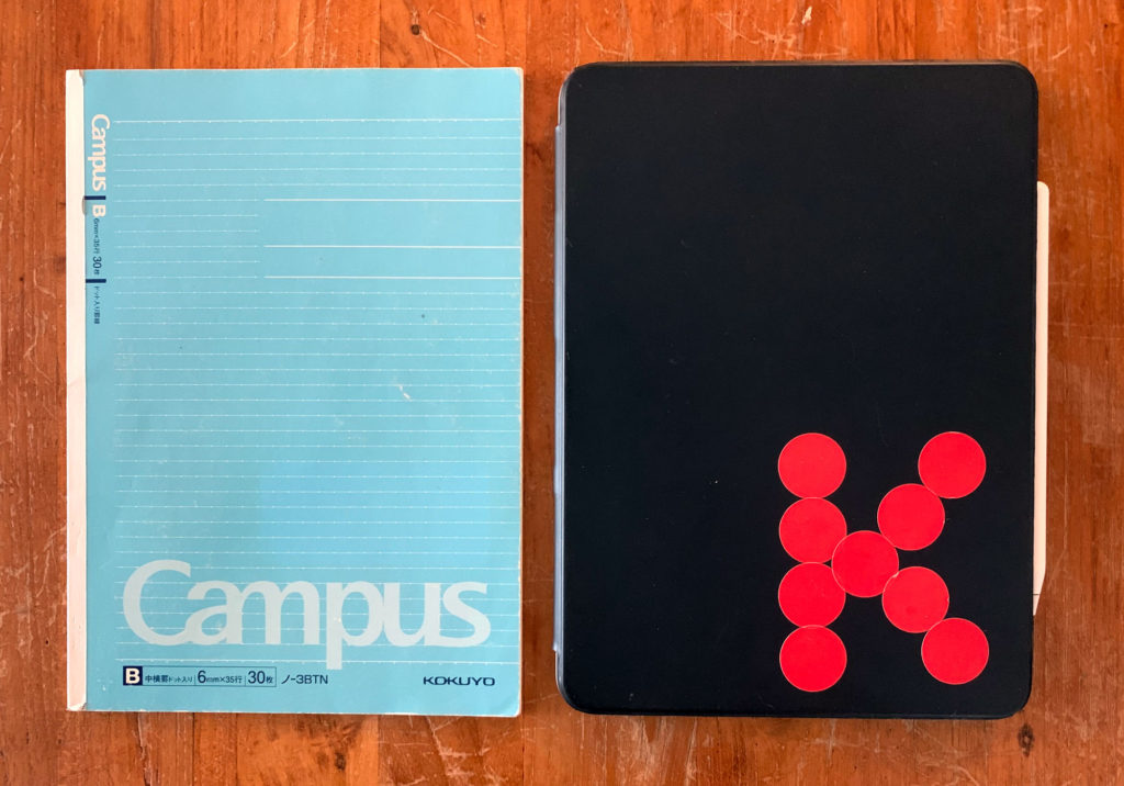
Size and thickness of the notebook are important, and so are the smoothness and thickness of the paper stock. I find page sizes that are too small restrict thinking. Standard sizes like A4 or US Letter are a bit too big and document-like. B5 seems to be ideal for note-taking, planning and ideation. The paper stock should be rather thin and smooth, and with not too many pages for portability. Line rules should not be printed too dark or they will detract from the content (see Edward Tufte’s ‘layering and separation’ principle). My last favourite paper notebooks have been Kokuyo’s Campus 3BTN notebook. The paper is super smooth, with 6mm rules and dots, which makes it essentially a grid paper without the distractions of vertical lines. How ingenious.
A Campus 6mm dot-line notebook I used at work in Hong Kong
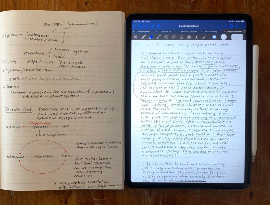
Well, paper notebooks are now a thing of the past for me. When I started using Goodnotes almost two years ago, I never looked back. Writing on an iPad is still not entirely satisfactory, even with the fantastic Paperlike screen protector. But being able to have any pen thickness and colour at one’s disposal, and the ability to search, bring in images, export in vector PDF format and sync across devices far outweigh traditional pen and paper in my opinion. I replicated the Campus 3BTN pattern as a Goodnotes template to make the rule increment to be exactly 6mm wide when displaying in full width on my iPad Pro 11-inch. The size of the device, incidentally, is almost exactly B5 as well. That is by no means to say that my stationery obsession has been cured – not quite just yet!
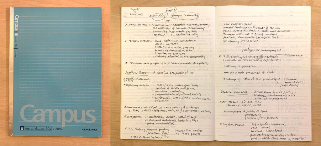
The B5 Campus notebook is almost identical in size with the 11-inch iPad ProA page of notes in the Campus notebook and a page of writing in the Goodnotes app
Thank you for reading this far. Next up: pens – watch this space.
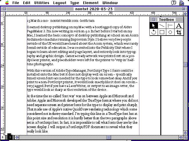
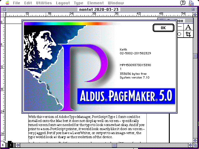
I learned desktop publishing on my Mac with a bootlegged copy of Aldus PageMaker 3. I’m now writing in version 5.0. In fact before I started on my Mac, I learned the basic concepts of desktop publishing at school on an Acorn Archimedes machine running Impression Style. I believe very few people outside of the UK would have heard about the Acorn system, which was rarely found outside of education. I was recruited into the Publicity Unit where I began to learn about editing and page layout, and seriously look into typography and graphic design. Camera-ready artwork was printed out on a 300-dpi laser printer, and placeholders were left for the printer to ‘strip in’ half-tone photographs.
With this version of Adobe Type Manager, PostScript Type 1 fonts could be installed onto the Mac but it does not display well on screen – specifically tuned screen fonts are needed for the type to look somewhat okay. And if you print to a non-PostScript printer, it would look exactly like it does on screen – very jagged. But if you have a LaserWriter, or output to an image-setter, the type would look as sharp as the resolution of the device.
At the time the so-called ‘font war’ was on between Apple and Microsoft and Adobe. Apple and Microsoft developed the TrueType format where you did not need separate screen and printer fonts for the type to display and print sharply. That made use of Apple’s native QuickDraw rendering technology which some considered not industry standard. I’m typing this line in a TrueType font but at this point size and resolution it is hardly better than the two paragraphs above set in a PostScript font. In fact, it is impossible to tell what fonts they are by the screen display. I will output a PostScript/PDF document to reveal what they really look like.