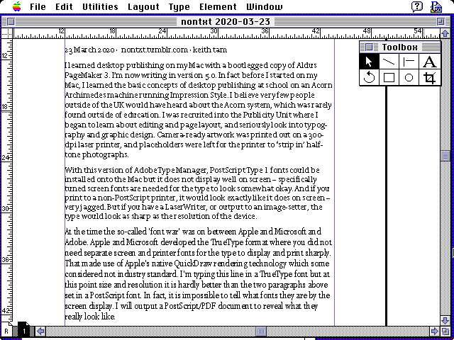
I learned desktop publishing on my Mac with a bootlegged copy of Aldus PageMaker 3. I’m now writing in version 5.0. In fact before I started on my Mac, I learned the basic concepts of desktop publishing at school on an Acorn Archimedes machine running Impression Style. I believe very few people outside of the UK would have heard about the Acorn system, which was rarely found outside of education. I was recruited into the Publicity Unit where I began to learn about editing and page layout, and seriously look into typography and graphic design. Camera-ready artwork was printed out on a 300-dpi laser printer, and placeholders were left for the printer to ‘strip in’ half-tone photographs.
With this version of Adobe Type Manager, PostScript Type 1 fonts could be installed onto the Mac but it does not display well on screen – specifically tuned screen fonts are needed for the type to look somewhat okay. And if you print to a non-PostScript printer, it would look exactly like it does on screen – very jagged. But if you have a LaserWriter, or output to an image-setter, the type would look as sharp as the resolution of the device.
At the time the so-called ‘font war’ was on between Apple and Microsoft and Adobe. Apple and Microsoft developed the TrueType format where you did not need separate screen and printer fonts for the type to display and print sharply. That made use of Apple’s native QuickDraw rendering technology which some considered not industry standard. I’m typing this line in a TrueType font but at this point size and resolution it is hardly better than the two paragraphs above set in a PostScript font. In fact, it is impossible to tell what fonts they are by the screen display. I will output a PostScript/PDF document to reveal what they really look like.