

A project on the art, acts and technologies of writing, editing and publishing
The way type sizes are measured on typewriters is a bit different from traditional/digital typography. In fixed-width typewriters, type sizes are measured in ‘characters per inch’ (cpi). The most common are Elite (12 cpi) and Pica (10 cpi). Elite is therefore a smaller type than Pica. Amongst my three typewriters that use different printing mechanisms, I have a total of eight different type sizes to work with. I will display them [above].
Fellow University of Reading alumnus María Ramos Silva wrote an excellent MA Typeface Design dissertation on type design for typewriters, particularly by Olivetti (2015). Definitely worth a read if you’re interested in the interaction between the social, cultural, technological and design aspects of typewriters.
(written on an Olympia Carrera de Luxe, second [final] draft)
[typos further corrected when input as digital text]


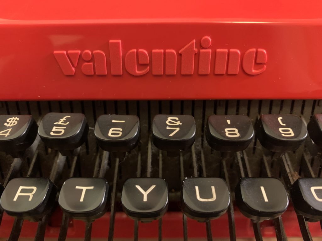
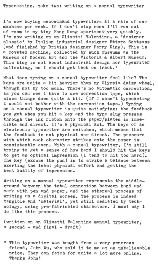
I’m now buying second-hand typewriters at a rate of one machine per week. If I don’t stop soon I’ll run out of room in my tiny Hong Kong apartment very quickly. I’m now writing on an Olivetti Valentine, a ‘designer classic’ by Italian industrial designer Ettore Sottsass (and finished by British designer Perry King). This is a coveted machine, collected by such museums as the Museum of Modern Art and the Victoria & Albert Museum. This blog is not about industrial design nor typewriter collecting, so I should get back on track.*
What does typing on a manual typewriter feel like? The keys are quite a bit heavier than my Olympia daisy wheel, though not by too much. There’s no automatic correction, as you can see I have to use correction tape, which slows things down quite a bit. (If I wasn’t typecasting I would not bother with the correction tape.) Typing on a manual typewriter is quite satisfying: the feedback you get when you hit a key and the type slug presses through the ink ribbon onto the paper/platen is immediate and direct. It’s a physical act. The keys of an electronic typewriter are switches, which means that the feedback is not physical nor direct. The pressure with which each character strikes onto the paper is consistently even. With a manual typewriter, I’m still trying to get a sense of how hard I should hit the keys to get an optimal impression (I tend to hit too hard). The key (excuse the pun) is to strike a balance between exerting the least physical effort and getting the best quality of impression.
Writing on a manual typewriter represents the middle-ground between the total connection between hand and mark with pen and paper, and the ethereal process of writing on a digital screen. The process is indeed tangible and ‘material’, yet still mediated by technology, using pre-fabricated characters. I must say I do like this process.
(written on an Olivetti Valentine manual typewriter, a second – and final – draft)
* This typewriter was bought from a very generous friend, John Wu, who sold it to me at an unbelievable price. They can fetch for quite a lot more online. Thanks John!
Apparently typecasting is a thing – typing on a typewriter then posting a scanned image of the result in a blog. Joe van Cleave’s blog is an example. Joe suggests that in the age of word processing, there is still a place for typewriters as a writing tool for first drafts, using paper as a ‘memory system’ for ‘stream of consciousness’ writing, then transferred onto a computer/word processor for editing later. Well, this is a second draft of this blog post. Let’s see if it will also be a final draft that I post on to nontxt.com.
I started this post on 21 April on this secondhand Olympia Carrera de Luxe daisy wheel typewriter, a machine similar to the one I had when I was 10 years old. It actually feels very natural to type on this machine again. One thing is different though: I wasn’t a fluent writer in English then, and I had never used a typewriter as a tool for composing prose in a meaningful way at that time (late 1980s). My fascination for typewriters then was only with the machinery and the ‘romanticism’ of it. Now that I’m actually composing something meaningful on this machine feels rather different . Does writing on this typewriter make me ponder my ideas and words more carefully? Although I can correct mistakes on this machine, it is not as easy or seamless as on a computer, so I tend not to erase complete sentences (or even words for that matter), let alone complete paragraphs or moving things around. I actually spend more time writing rather than editing, which I guess can be a good thing.
After the invention of the typewriter, it quickly became a business machine, used for documents and business correspondence. It symbolised efficiency and accuracy, and made penmanship obsolete. Because of the technical limitations, the letters are monospaced – meaning all letters occupy the same amount of space, however wide or narrow they should ideally be. This made text typed on a typewriter having a distinctive look. (Though some typewriters offered proportional spacing such as the IBM Composer, but I’ll leave this subject to a future post perhaps.) The ‘monospaced look’ gradually became synonymous with the very idea of ‘writing’, and perhaps also ‘informality’ or ‘draft’, something that isn’t ‘published’ perhaps. Do we still have this association? I’m probably of the last generation who still have that association. Newer generations, not so much. But the association of ‘code’ or ‘screenplay’ with monospaced typefaces perhaps still exist . There is something about typing in a monospaced typeface that makes the writing less precious for me, suggesting that it is a draft, not a finished or published piece of writing.
The typewriter did not only become a business tool, it was also favoured by writers, for drafting and putting together manuscripts. The ‘congruence between thought and action’ that I mentioned before was perhaps a factor for the typewriter’s wide adoption as a writer’s tool, that it is more efficient for transcribing thoughts into tangible marks on paper than a pen. And also spared typesetters and editors of the agony of unintelligible handwriting.
I’m typing too carefully to be writing down a ‘stream of consciousness’ right now on this typewriter, knowing that it will be ‘typecasted’, and am exercising my typographer’s craft when doing so. I’m writing, editing, as well as producing a ‘camera-ready’ copy all at the same time, which is not something that unusual for people who are used to word processing on computers
these days.
On another note: This blog has now switched to a dedicated website rather than residing under Tumblr. I was frustrated by the way Tumblr handles images, so this is an improvement. -It is now more sophisticated-looking, which perhaps lost some of its original no-nonsense, direct and honest quality in its presentation? It now looks more ‘published’ than it did before, which makes any typos look particularly jarring. It now has a date stamp as well as a title for each post. These things kind of go against what I had set out to do with this project, and taking on a more formal quality than I intended . In any case, I’ll just relax and let the project take its natural course.
(Written on an Olympia Carrera de Luxe electronic daisy wheel typewriter, using the Prestige Elite 12 pitch typeface [12 characters per inch], on an ultra-smooth letter paper bought from a convenience store in Japan, giving a much crisper impression than regular laser stock.) [typos have been corrected]