While searching YouTube to find videos of typewriter demos (there are lots) I came across this guy named Joe Van Cleave from Albuquerque, USA who has a whole series of videos of him test-driving numerous manual and electronic typewriters in his collection (216 episodes!). I stumbled upon another series of his called ‘confessions of an office supply junkie’ where he reviews different types of stationery. Now it’s my turn to confess: this is also one of my obsessions, and it goes as far back as my early primary school years. I’ve always had a soft spot for nice stationery, but I tend to favour stuff that’s practical rather than novel. Pen and paper (in the form of pads and notebooks) are the bread and butter, and are amongst my favourite objects. I’m lucky that I live above a large shopping centre where there is no shortage of good stationery merely steps away from home, mainly from Japan. To this day, my favourite stuff comes from Japan. But in the past year or so I’ve noticed that the stationery departments of the two Japanese department stores nearby have shrunk in size. I might be one of the culprits of this demise, as roughly a year ago I replaced my paper notebooks with an iPad Pro and the Goodnotes app that I’ve been raving about. Guess visions of a ‘paperless office’ has finally caught on, after its prophecy in Business Week more than 40 years ago. Of course the first vision of it dates further back by Vannevar Bush in 1945 in an article in The Atlantic Monthly titled ‘As we may think’.
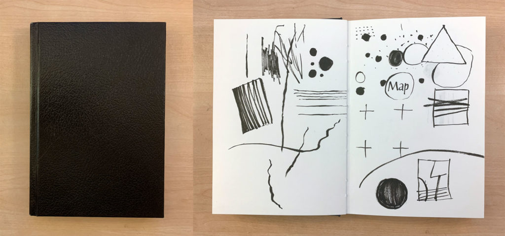
As for many art school-educated people like myself, we have been taught to keep a ‘sketchbook’. We were told to keep it close by at all times, even by your bedside, as you never know when ideas may strike. (Before art school I only had a Filofax, remember those?) Not being much of an artist-type, I struggled to fill the pages of my thick sketchbook. The standard kind that you could buy in Canada had a black hardcover with a heavy cartridge stock inside, casebound. The form of this kind of sketchbook carries the weight and pressure of having to draw a lot and all the time, which just isn’t me at all. I much prefer writing and sorting out ideas by means of words, with occasional drawings as annotations to figure ideas out and to structure concepts. I do sketch layouts, even to this day, and of course to explore letterforms as a type designer.
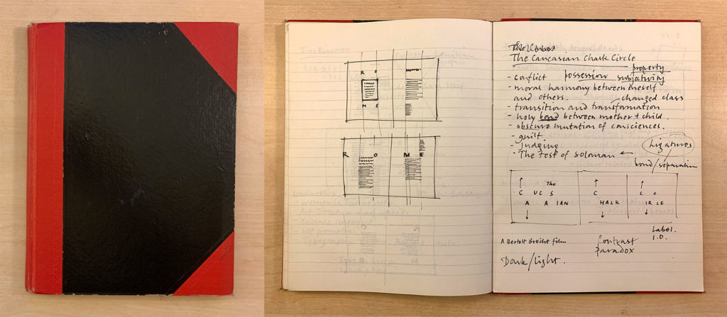
By the second year of art school I moved away from these black casebound sketchbooks to something I was more familiar with: black hardcover with bright red spine and reinforced corners, casebound with a light weight paper inside, faintly ruled in light grey. I bought these from Vancouver’s Chinatown, which I used in secondary school back in Hong Kong. This cheaper alternative immediately provided a freedom that the more expensive ‘artist’s sketchbooks’ didn’t have, and the ideas and thinking process suddenly felt less precious. I began to fill up the pages quickly and went through a few of them.
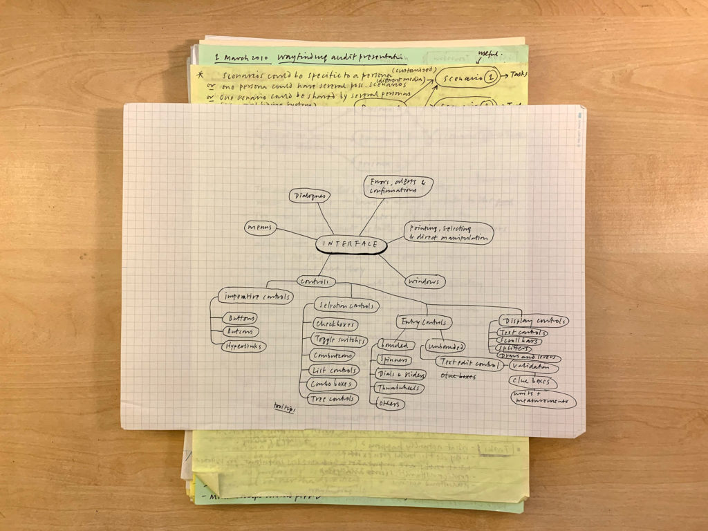
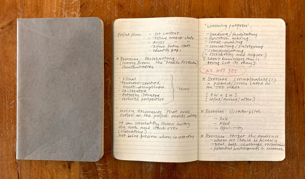
After that I tried different kinds of notebooks and wasn’t loyal to any particular kind/brand. I mainly used ruled paper, and experimented with different increments. How I felt about them depended on the typical size of my handwriting at the time and the kinds of pens that I used. My handwriting has shrunk over the years and now consider 6mm to be optimal. Off and on I tried using ruled index cards and carried a stack of them around held together with a bulldog clip (a so-called ‘hipster PDA’). Or just carrying one A4-size piece of random paper folded twice in my pocket (with a tiny pen) to think things through at a café. Off and on I had also used yellow legal pads and quad pads. My absolute favourite pad is ‘Project Paper’ by Okina Company Limited which won the ‘Good Design Long Life Award’ in 2010. It has been in production since 1985. This ultra smooth paper is very crisp and is extremely high quality, with a very faint non-repro blue 5mm grid. An absolute joy to write with. Not exactly cheap but worth every penny.
For a short while I was into the Moleskine ‘Cahier’ ruled journal. Softcover with a smooth yellowish paper, saddle stitched, 128×210mm. Portable and with a nice proportion. The 6mm line rules are not quite faint enough unfortunately.
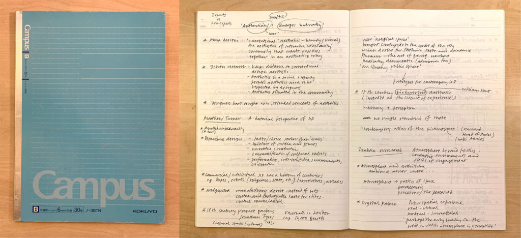
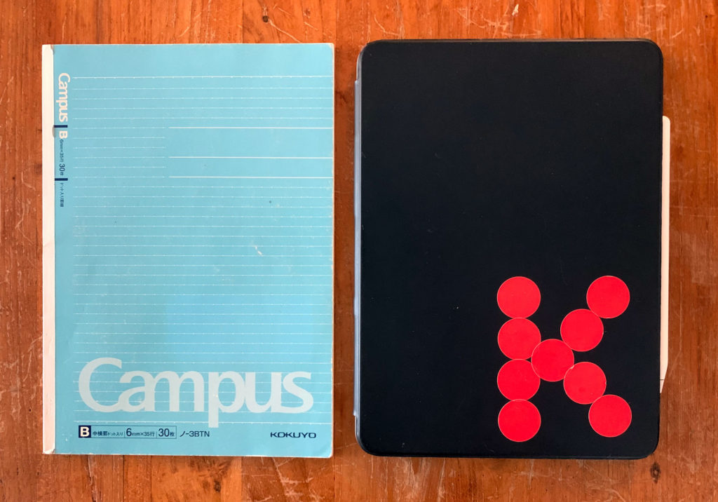
Size and thickness of the notebook are important, and so are the smoothness and thickness of the paper stock. I find page sizes that are too small restrict thinking. Standard sizes like A4 or US Letter are a bit too big and document-like. B5 seems to be ideal for note-taking, planning and ideation. The paper stock should be rather thin and smooth, and with not too many pages for portability. Line rules should not be printed too dark or they will detract from the content (see Edward Tufte’s ‘layering and separation’ principle). My last favourite paper notebooks have been Kokuyo’s Campus 3BTN notebook. The paper is super smooth, with 6mm rules and dots, which makes it essentially a grid paper without the distractions of vertical lines. How ingenious.
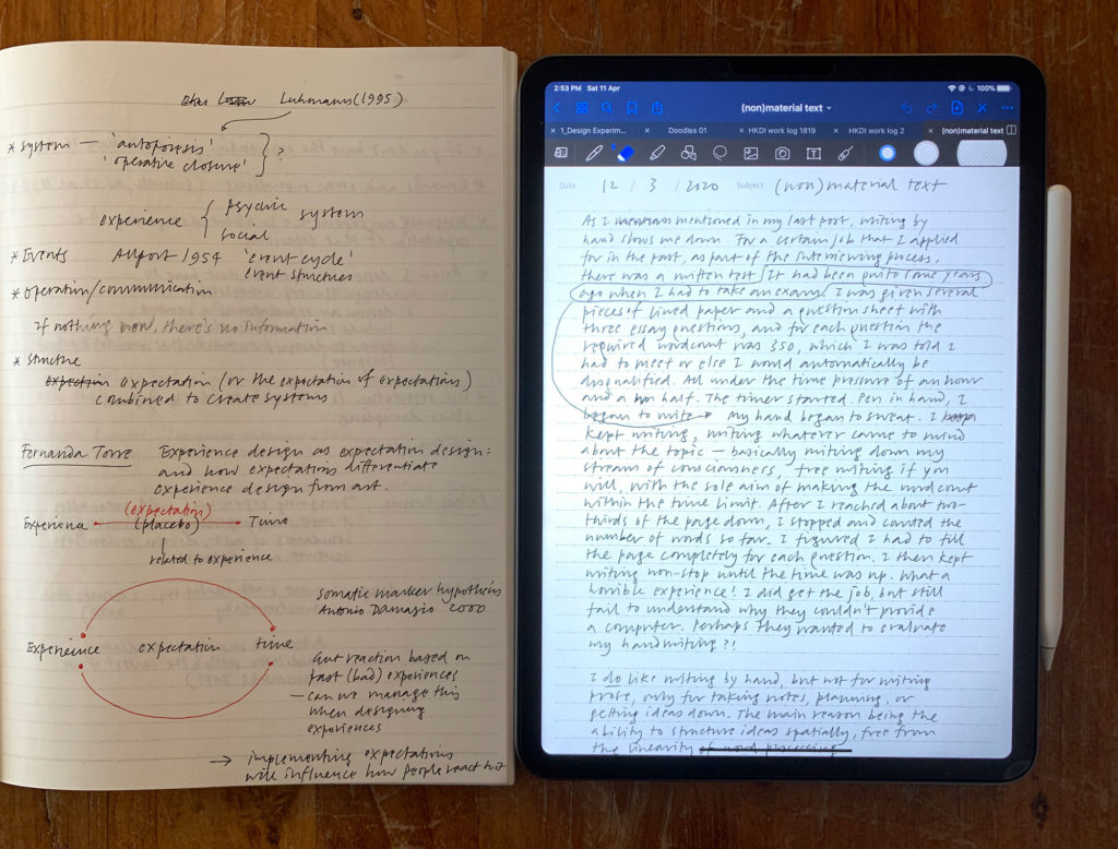
Well, paper notebooks are now a thing of the past for me. When I started using Goodnotes almost two years ago, I never looked back. Writing on an iPad is still not entirely satisfactory, even with the fantastic Paperlike screen protector. But being able to have any pen thickness and colour at one’s disposal, and the ability to search, bring in images, export in vector PDF format and sync across devices far outweigh traditional pen and paper in my opinion. I replicated the Campus 3BTN pattern as a Goodnotes template to make the rule increment to be exactly 6mm wide when displaying in full width on my iPad Pro 11-inch. The size of the device, incidentally, is almost exactly B5 as well. That is by no means to say that my stationery obsession has been cured – not quite just yet!
Thank you for reading this far. Next up: pens – watch this space.
(written in Byword)
