(scroll down for article in digital text and images)
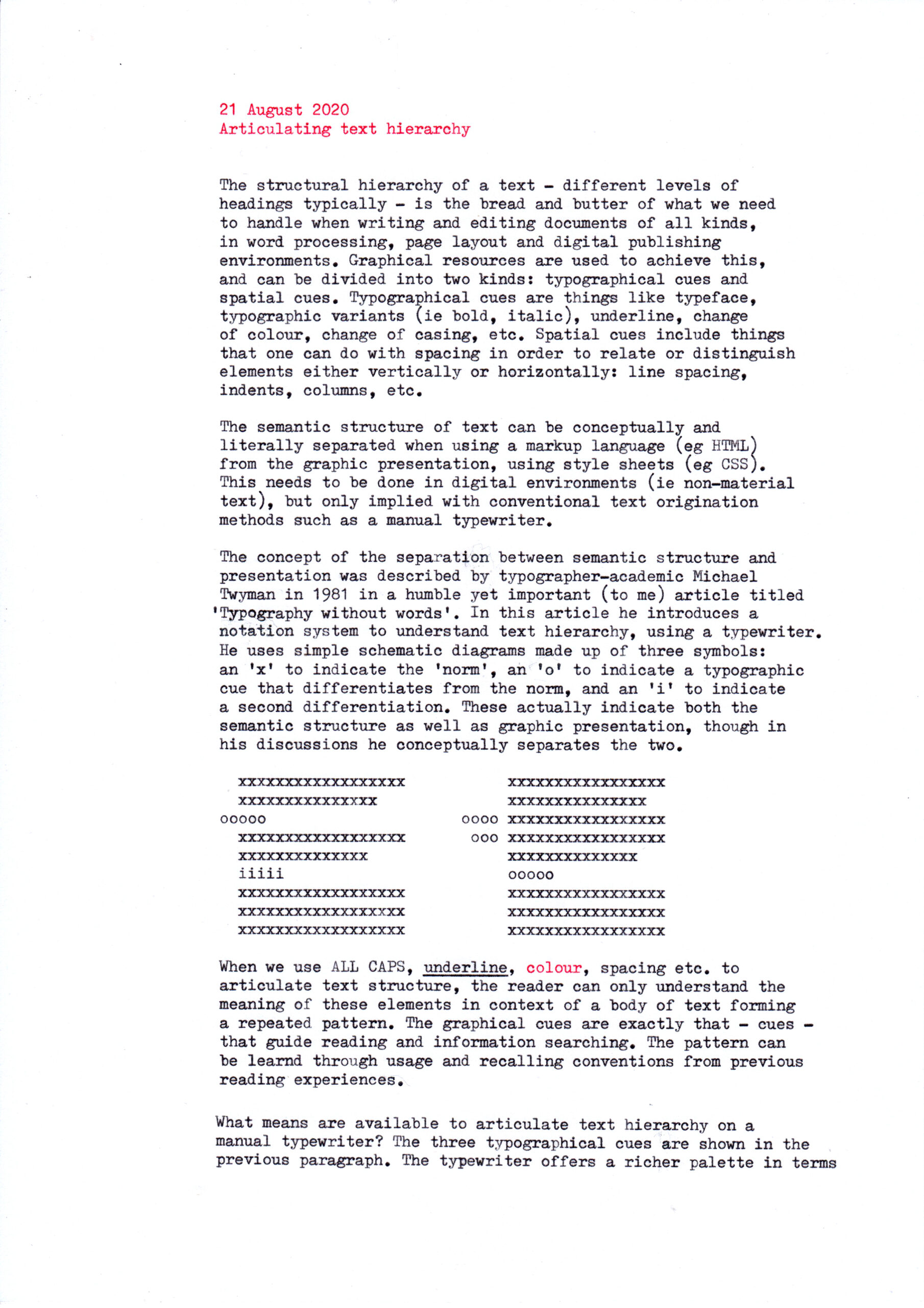


Visually coding the structural hierarchy of a text (ie different levels of headings, etc) is the bread and butter of what we need to handle when writing and editing documents of all kinds, in word processing, page layout and digital publishing environments. Graphical resources are used to achieve this, and can be divided into two kinds: typographical cues and spatial cues. Typographic cues are things like typeface, typographic variants (ie bold, italic), underline, change of colour, change of casing, etc. Spatial cues include things that one can do with spacing in order to relate or distinguish elements either vertically or horizontally: line spacing, indents, columns, etc.
The semantic structure of text can be conceptually and literally separated when using a markup language (eg HTML) from the graphic presentation, using style sheets (eg css). This needs to be done in digital environments (ie non-material text), but only implied with conventional text origination methods such as a manual typewriter.
The concept of the separation between semantic structure and presentation was described by typographer-academic Michael Twyman in 1981 in a humble yet important (to me) article titled ‘Typography without words’. In this article he introduces a notation system to understand text hierarchy, using a typewriter. He uses simple schematic diagrams made up of three symbols: an ‘x’ to indicate the ‘norm’, an ‘o’ to indicate a typographic cue that differentiates from the norm, and an ‘i’ to indicate a second differentiation. These actually indicate both the semantic structure as well as graphic presentation, though in his discussions he conceptually separates the two.
When we use ALL CAPS, underline, colour, spacing etc. to articulate text structure, the reader can only understand the meaning of these elements in context of a body of text forming a repeated pattern. The graphical cues are exactly that: cues that guide reading and information searching. The pattern can be learned through usage and recalling conventions from previous reading experiences.
What means are available to articulate text hierarchy on a manual typewriter? The three typographical cues are shown in the previous paragraph. The typewriter offers a richer palette in terms of spatial cues: line spacing, space between headings and paragraphs, indents and tabs can be used effectively to differentiate structural components in a complex text.
As shown and discussed in Sue Walker’s book Typography and language in everyday life: prescriptions and practices (2001), because of the simplicity of the typewriter and the narrower palette of options available, text hierarchy is often more effectively articulated in typewritten documents compared to word-processed or desktop-published documents, especially in the early days of word processing and desktop publishing.
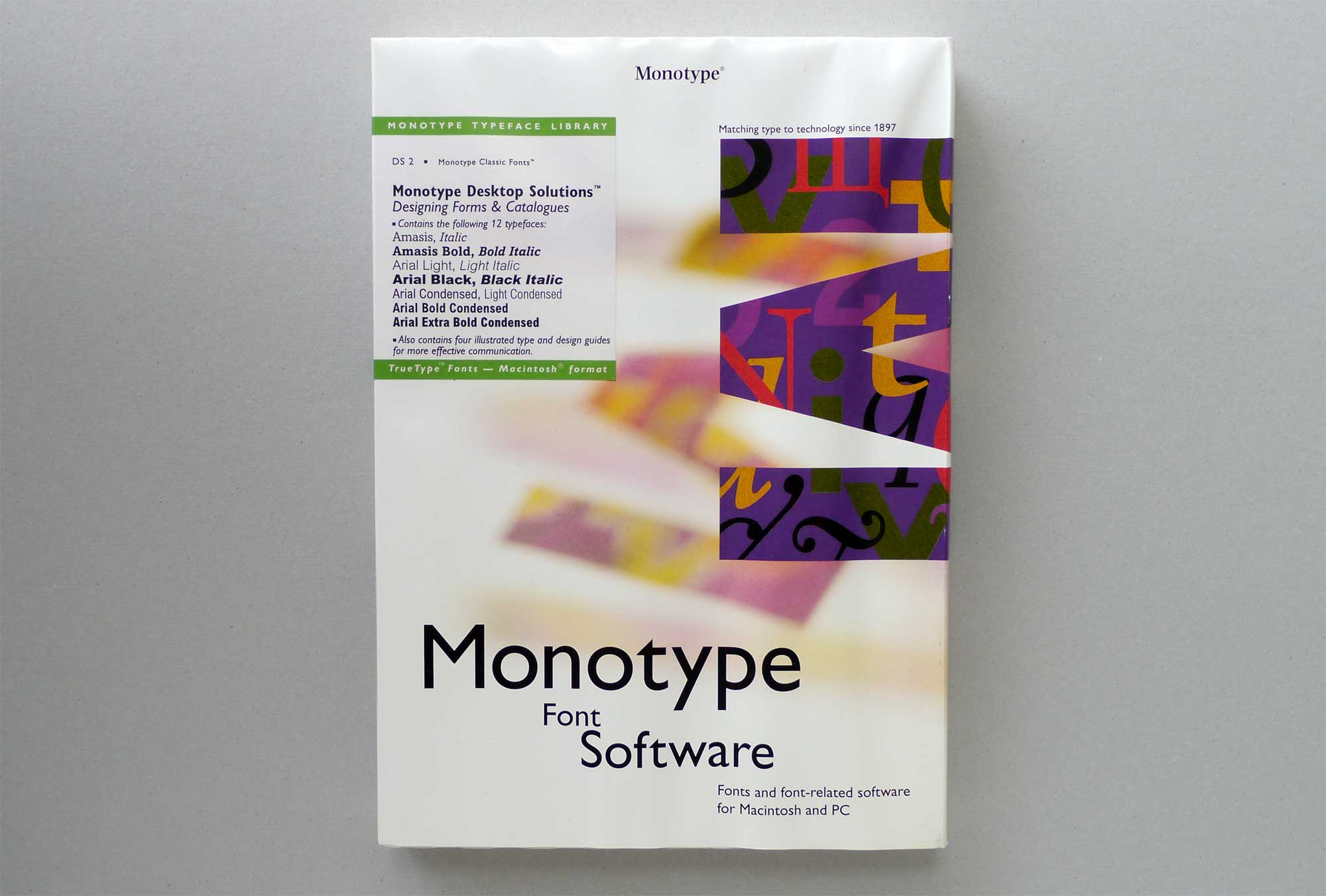
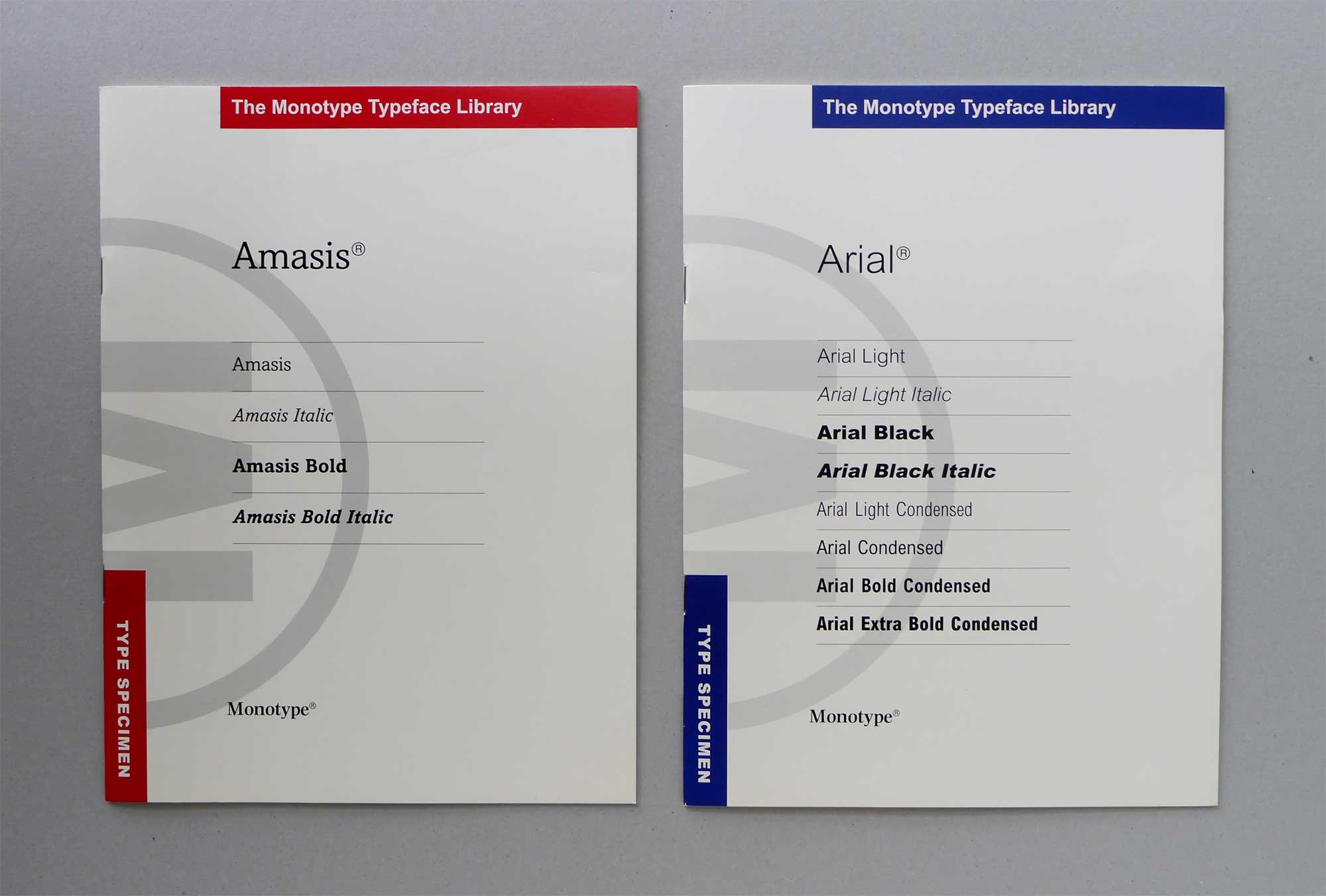
Having said that, the opposite might also be true. Old habits die hard; after more than 30 years of the phasing out of the typewriter in the office, old typewriter habits are still very much alive and well in typical office documents: two spaces after full stops, very deep indents, the lack of hanging numerals and bullets in lists , primes instead of apostrophes and quotation marks, underlining, centre-aligned headings, and the use of a single type size throughout a document. Gone are the typing manuals and secretarial schools, but software that the typical user works with daily are now almost as sophisticated as professional page layout packages. What’s worse, the die-hard habits in turn challenge the established standards of typesetting and document design. We need better tools for creating modern digital documents, and the skills associated with them, beyond what we have inherited from the days of the typewriter. The Designing business documents booklet by Chris Burke et al published by Monotype as part of the Monotype Desktop Solutions series in 1992 (distributed with font packages) remains an excellent resource on the subject which is still relevant today for novices and aspiring professionals alike.


Further reading:
Burke , C; Black , A; Stiff, P; Waller, R (1992) Designing business documents. Surrey , UK: Monotype Typography Ltd
Twyman, M (1981) Typography without words, in Visible Language XV, no. 1, 5–12
Walker, S (2001) Typography and language in everyday life: prescriptions and practices. Harlow, England: Pearson Education
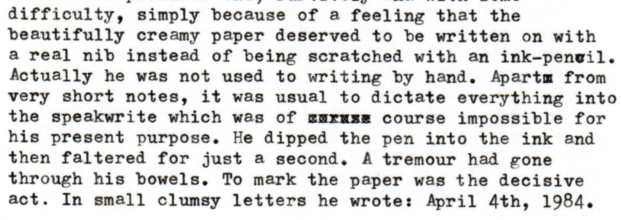
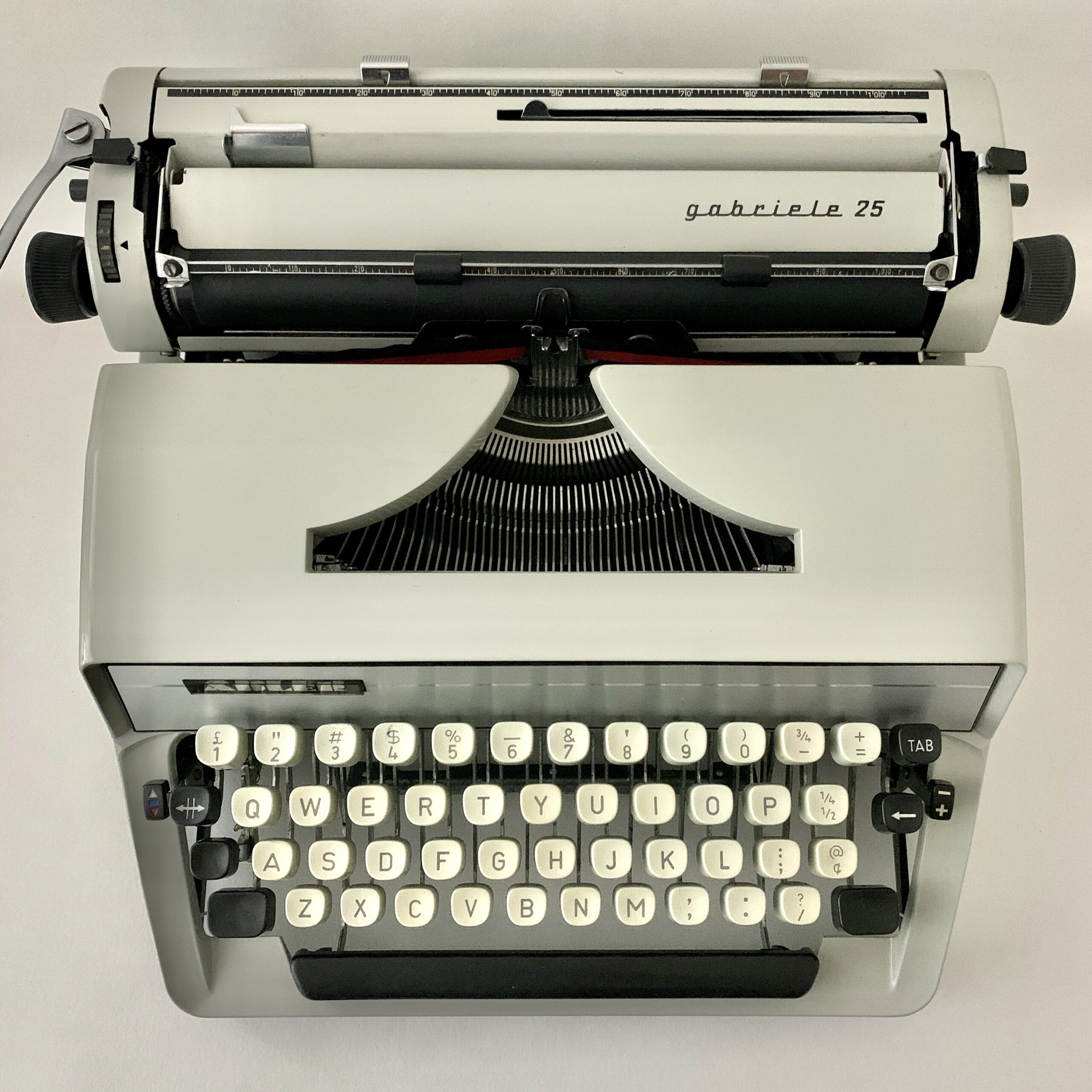
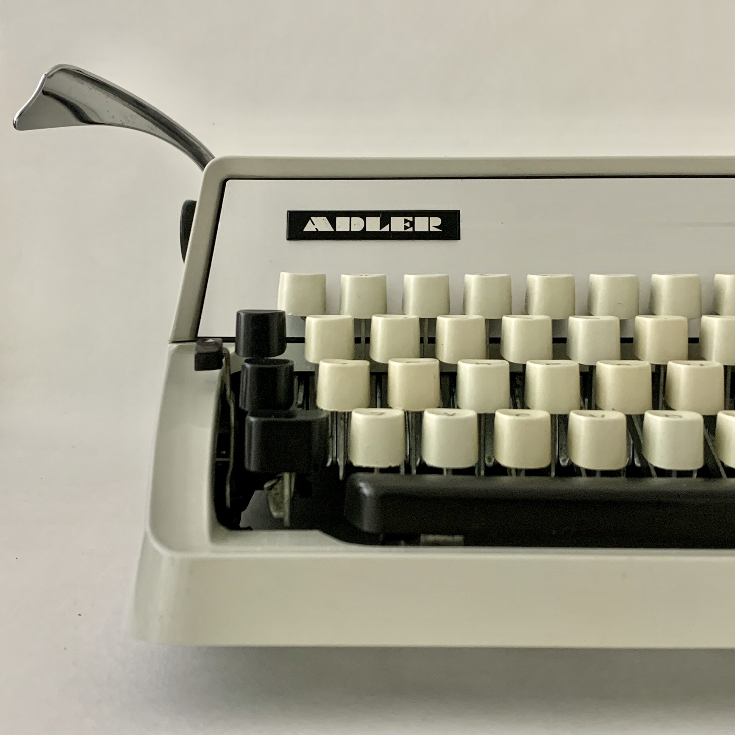
(second draft written on an Adler Gabriele 25, third and final draft scanned and input via optical character recognition and slightly corrected and edited)
Some German typewriters offer another means of emphasis:
e x t e n d e d s p a c i n g .