Sulki & Min: Clarifying & Obscuring

Sulki and Min’s cerebral, intelligent work really strike a chord with me. I was fortunate enough to be at the opening of their latest exhibition Sulki & Min: Obscuring & Clarifying in Hangzhou earlier this week. Their experience studying and working in the Netherlands, studying under Sheila de Brettville at Yale, their influences from Robin Kinross’s writings as well as Jan Tschichold’s typographic ethos made for a theoretically-grounded and almost academic praxis to graphic design and typography. I am deeply mesmerised by their oeuvre.

For the Hangzhou exhibition, they translated a small booklet titled Explained into Chinese, which was first published in 2017. The booklet contained rationales for each project on display at the exhibition, unillustrated. Readers could read the rationales at the exhibition while viewing each work by referring to the numbers, or read it away from the work and imagine what the work might look like, much like reading a work of fiction. The text paper is a glossy coated stock, with the cover and endpapers in a rather commonplace leather-like textured paper that one might find in a bog-standard printshop. The text is set in a single size and weight of (I believe) Lanting Hei and Univers. The cover is a curious, abstract graphic foil-blocked in white on the red paper. I read it as three lines of illegible text, blurred. The design is visually austere yet conceptually captivating.

Another publication titled Explain Explained is a saddle-stitched booklet contained in a simple grey chipboard slipcase. The self-cover booklet is printed on a light-weight, lightly coated stock. The fore-edge is left untrimmed, hence creating a v-shape slanting in two directions. This coincides with how the bilingual texts are organised: Chinese opens on one side, and English the other, flipped head to tail. This subtly enables the reader to place their thumb on the fore-edge and easily flip the pages for a specific language and stop right in the middle where the two languages meet. The extent of the text is short, yet the content is rich with nuggets of insights into the duo’s background and design philosophy. A conversation with Sulki and Min are organised into five sections, followed by two short essays by Lu Tao and Gideon Kong. Again the text is set in a single size and weight, this time in Grotesque Classic (for English) and Monotype Hei (for Simplified Chinese). I enjoyed the layout of the dialogue where a thin rule is drawn vertically through the centre of the page, with Sulki’s answers occupying the left column and Min’s answers on the right. Where one answer ends, the other answer begins on the same line; the questions are indented and run across the dividing rule. This schema is simple yet extremely well considered, and subtly suggests the duo’s complementary working relationship. It makes for a delightful reading experience. I capture two quotes that particularly resonated with me here:

‘[…] I don’t think [cultural identity] is something you should seek. On the contrary, it should be something that comes despite yourself. Something that you can’t help, or something that it’s just fine to leave traces of in your work.’ — Choi Sulki

Sulki: ‘I feel the whole business of wanting to be someone, including your “true” self, is just a waste of time. You are what you are, no matter what you or other people think. You need to acknowledge it and nurture it, but you shouldn’t feel that you are deprived of yourself. It just doesn’t make sense.’ — Choi Sung Min

The souvenir folder, with a deadpan paragraph of descriptive text screen-printed in white on a pedestrian stationery store folder in turquoise, is also a conceptually interesting piece that I quite enjoy.

Sulki & Min: Clarifying & Obscuring
24 March–26 May 2024
Noon–6pm daily, closed on Mondays

Transtage
211, B Block, JNA Art Park
415 Chengye Road, Binhiang District
Hangzhou

(Written on the Freewrite Alpha and edited in the Mention app and WordPress)
An ode to books

Books are my favourite objects. There is nothing more satisfying than flipping through a well made book. There are of course badly made books, too. But those books also deserve to be published. They nonetheless still add to the world’s knowledge.

The physical properties of a book make them great objects. A stack of paper, bound together on one edge, becomes a sequence of planes with tremendous potential for different reading patterns. This structure, though seemingly linear, actually offers infinite possibilities in terms of how it could be engaged with, and how the narrative is to be structured. Books can be anywhere from small, slim and light to large, thick and heavy. Whatever size or form, they are structurally captivating. The double-page spread is something quite unique. Two planes sit on either side of the gutter (spine) which acts as an axis to visually separate yet sequentially unite the recto and verso pages. A book is hence spatial and metaphorically architectural. (Is there an epistemological function to the codex format? This is worth looking into.)

The structural qualities of a book provides a unique canvas for which content inhabit. The content could be text, or any combination of text and images. The pages as units of measurement may be inconsequential as far as content is concerned – the text flows through the sequence of pages as if water fills a container. The pages become significant only where there are section or chapter breaks. Page units of course could work in tandem with the content, for example, with each double-page spread defined as picture planes in and of themselves. Narratives can visually unfold as images and text juxtapose and animate across spreads. The author and designer hence orchestrate the flow and pace of how the content is revealed to the reader, much like a director does to a film. A book is hence temporal.

Turning something into a book form miraculously transforms it into a unique work in its own right. Hence a manuscript of a book is not an actual book but a string of text, a document. Design transforms it into a book, along with the physical qualities.

Theoretically, say, one takes four sheets of A2-size paper with random content printed or drawn on both sides. Fold each sheet down three times into eight divisions of equal size. Stack these folded sheets together. Bind them together using threads and a needle, then trim on three sides. You now have a book with 64 pages slightly smaller than A5 size. The somewhat random content has now been given a sequential order, and has been transformed and given a new life in the form of a book.

The extent of a book varies depending on subject matter, genre and circumstances of use. Large volumes call for robust binding and content navigation. Regardless of the extent of a book, it is a closed object that defends itself against other book objects. It is a work of authorship that stands on its own. It can reference and contend the arguments of other books of course, and can equally be referenced and contended by others.

How about digital books? That tangible, spatial–structural quality of the codex is all but lost, and I would argue that we have not yet solved the spatial and temporal shortcomings of digital books, nor have we reinvented the codex format into a new medium altogether, never mind a whole new paradigm. Digital documents are still a far cry from physical books. Though hypertext as Tim Berners-Lee conceived it in 1989 was already a revolutionary paradigm shift, forever transformed our relationship with information, our sense of geography and our sense of self. While the codex as a physical format will continue to be remediated (imitated) in the digital ether that will soon take the form of the metaverse, the physical codex will remain as one of the most reliable, novel and persuasive ways to preserve and pass down human knowledge.

(Random thoughts to be continued and hopefully illustrated, here published in an incomplete form. Written on flights TK071 from Hong Kong to Istanbul and TK1907 from Istanbul to Zurich, using an iPhone 12 mini in Byword.)

The podcast, transcribed

In the previous post I posted the audio podcast and the script/notes that I had prepared ahead of time. Now, I’m posting a transcription of it. It was done automatically with otter.ai, an excellent automatic transcription service. Though I had to edit extensively still, to edit out the ums and ahs and the you knows and I means. It’s not a verbatim transcript, as I’ve edited out the stuff that I thought was not relevant too, but it wasn’t a rewrite into a new thing, but something in between.

Transcription published in LinkedIn

A podcast and its script

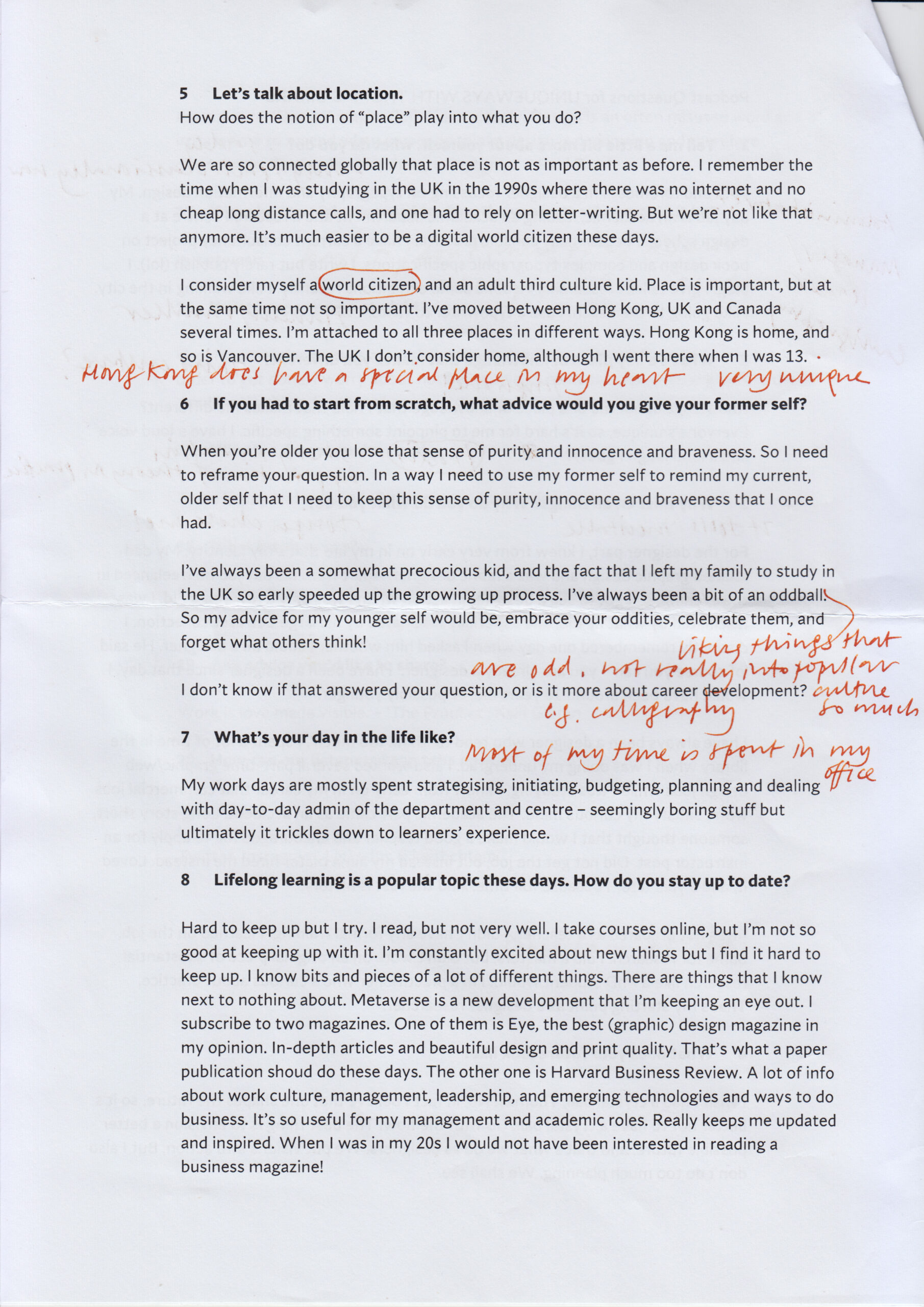
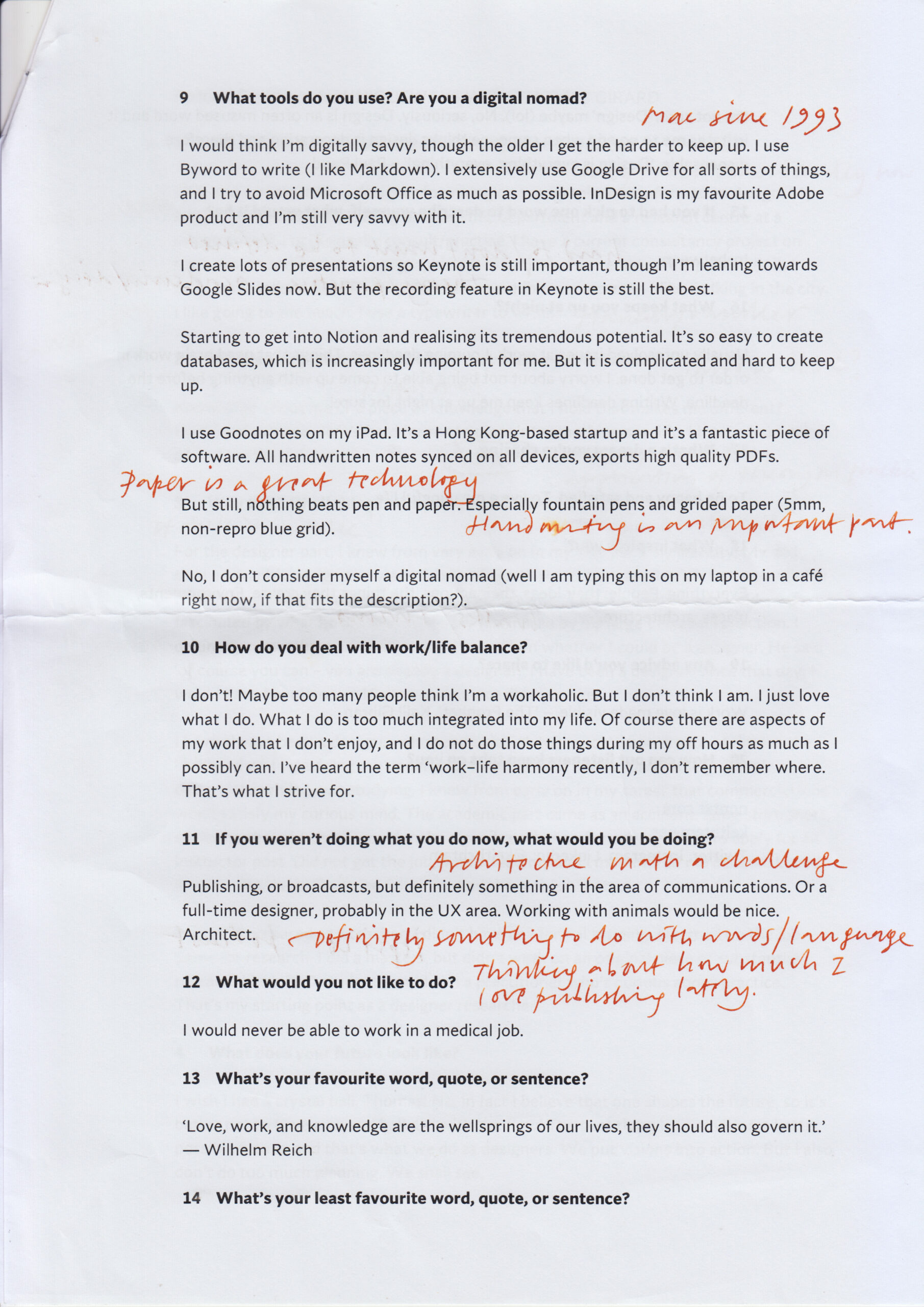
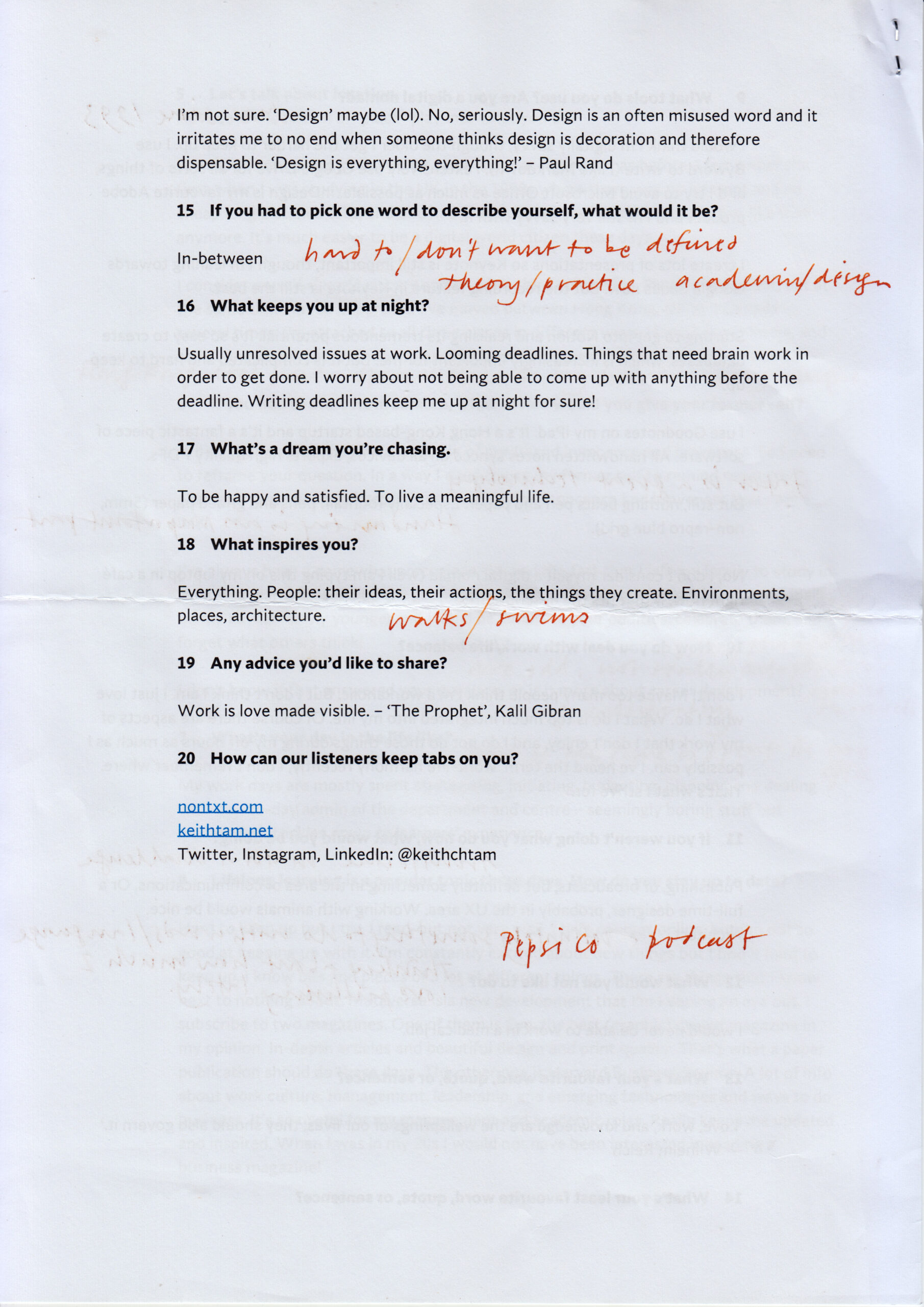
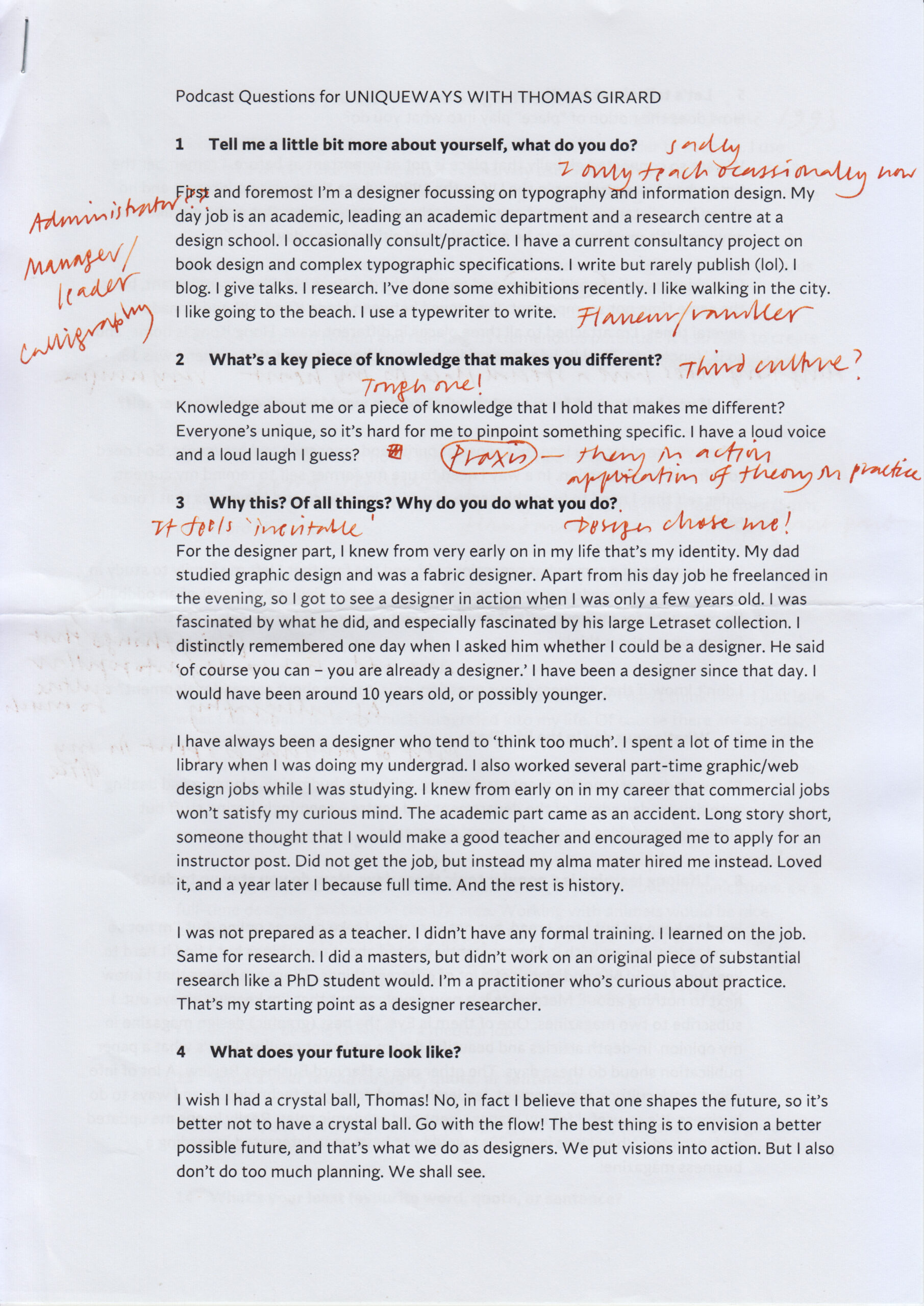
I was invited by Thomas Girard of uniqueways.ca as a guest on his new audio podcast channel. The format is the same for all guests to his podcasts: they answer 20 preset questions. I emailed my responses to Thomas ahead of the recording session. I then printed it out, annotated it with additional things that I thought I might talk about (this document was referred to when answering question nine). Although I somewhat loosely followed the script during recording, I mostly ad-libbed throughout, and you’d find that I talked about a lot of things that aren’t written in the script prepared. Here are the scans of my notes.

Convert: text to speech

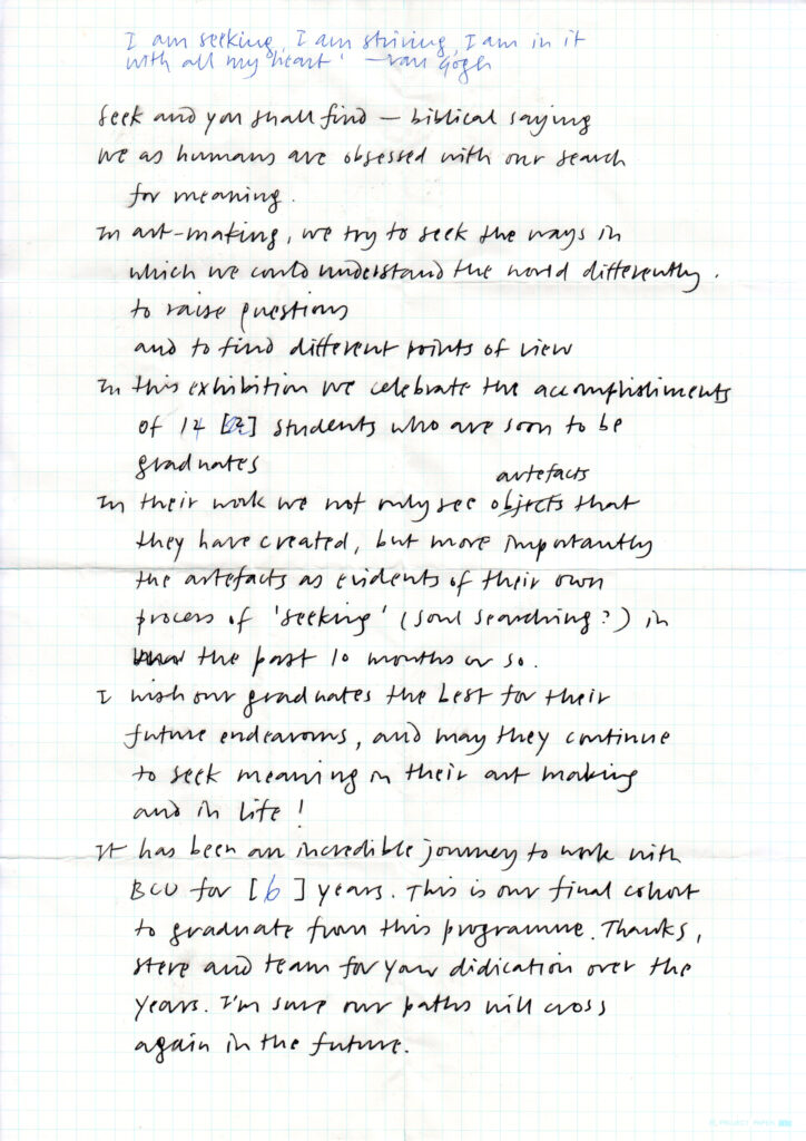
I rarely prepare speeches verbatim. Have always believed that speeches should be somewhat spontaneous, and I’m mostly happy to just ad-lib away. Reading a speech prepared verbatim beforehand usually makes it far too formal and contrived. Though I do find that holding a piece of paper calms my nerves. For this degree show address, I started writing short reminders for what I was going to say, but it turned out more like written prose than speech. In the end, the script became a crutch that disrupted the natural flow of my speech. Should have just memorised it.

Related post: Heinrich von Kleist: On the gradual completion of thoughts during speech