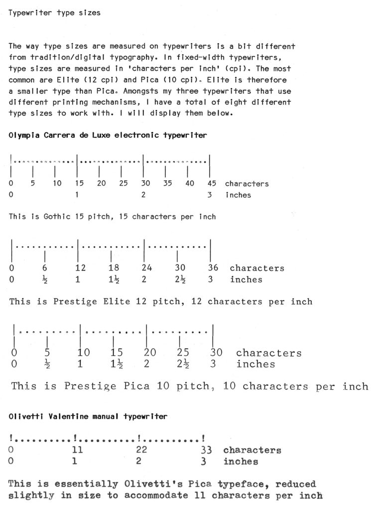
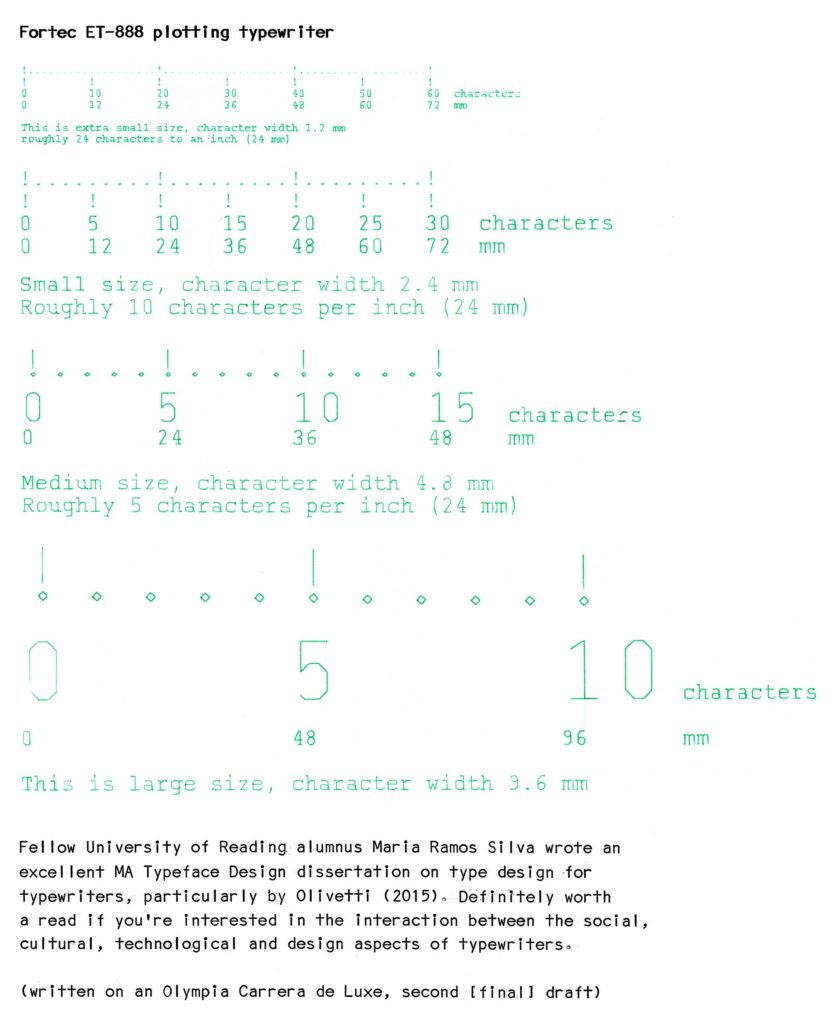
The way type sizes are measured on typewriters is a bit different from traditional/digital typography. In fixed-width typewriters, type sizes are measured in ‘characters per inch’ (cpi). The most common are Elite (12 cpi) and Pica (10 cpi). Elite is therefore a smaller type than Pica. Amongst my three typewriters that use different printing mechanisms, I have a total of eight different type sizes to work with. I will display them [above].
Fellow University of Reading alumnus María Ramos Silva wrote an excellent MA Typeface Design dissertation on type design for typewriters, particularly by Olivetti (2015). Definitely worth a read if you’re interested in the interaction between the social, cultural, technological and design aspects of typewriters.
(written on an Olympia Carrera de Luxe, second [final] draft)
[typos further corrected when input as digital text]


When I got started on digital type lback in the ’80s, I was pleased to realize people had figured out that by setting the advance width of monospaced glyphs to 60% of the em, one could use “10 point” scaled size to get elite (12 cpi) and “12 point” to get pica (10 cpi). Not every monospaced digital font uses this feature, but I believe most still do.
Nice to see you here David. I did realise that, and for awhile I used Courier at 12pt to ‘pretend’ it to be Pica for writing my reading précis at Emily Carr, using WordPerfect on a MacPlus, printing out on an ImageWriter II (all were already outdated tech back then). It’s a very useful feature, I guess especially when in those early days some people still printed to LQ daisy wheel printers.
See LinkedIn post:
https://www.linkedin.com/posts/keithchtam_design-writing-designeducation-activity-6527737061544423424-Inmk
Nice to see you here David! I noticed this feature and did use my Mac to imitate typewriter sizes.